
The Situation
Problem Statement
The company was facing a critical moment of digital transformation. After years of relying on print materials and disconnected digital touchpoints, the post-pandemic landscape pushed the business to fast-track its digital strategy and expand the product design team.
Project Scope
Design and implement the foundational elements of a global design system to support the company’s shift to digital-first experiences.
ENVIRONMENT
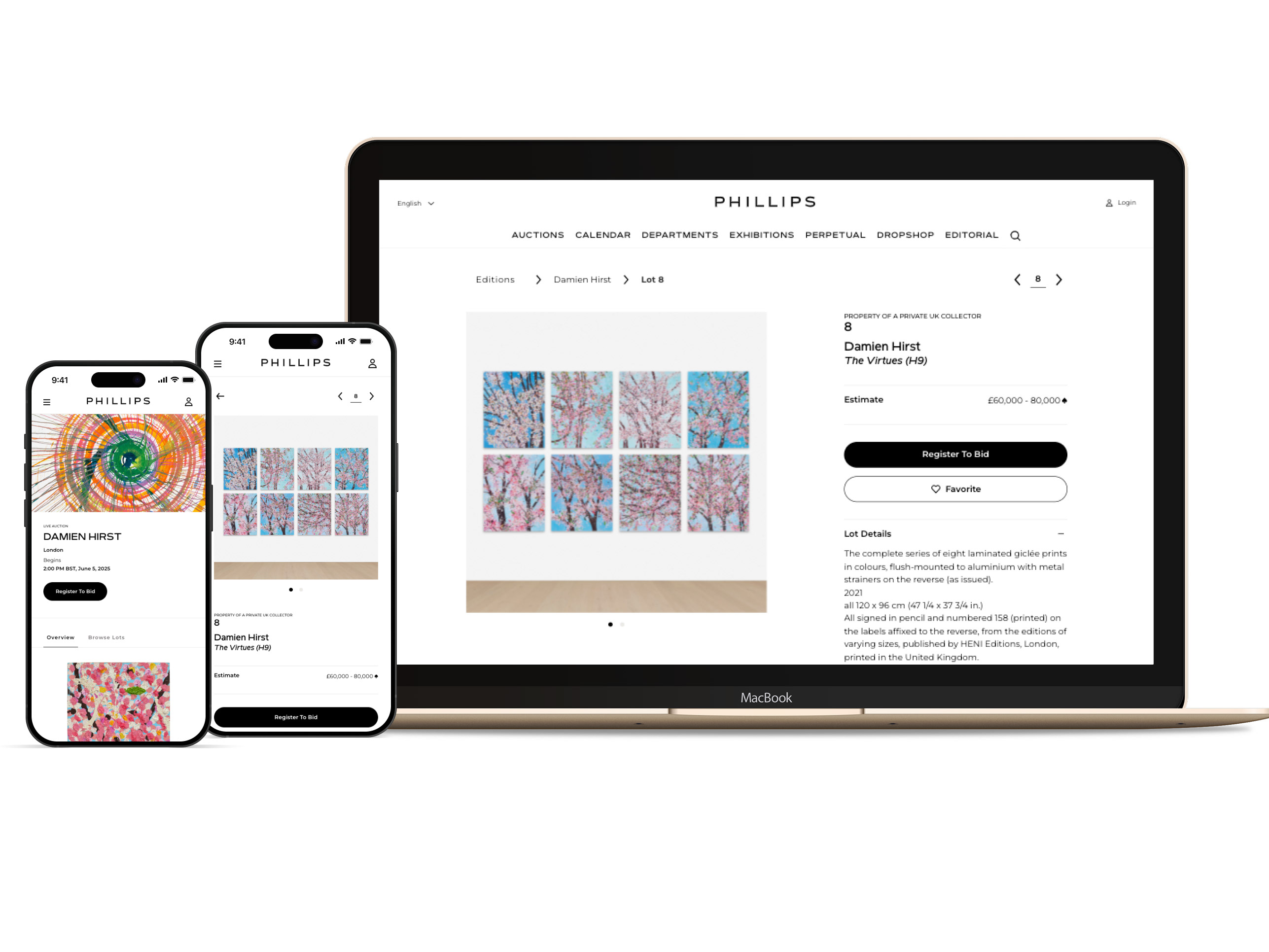
With physical catalogs on the way out, we focused on transforming high-visibility, client-facing experiences — namely, the Auction Listing and Lot Description Pages. These would serve as the testbed for defining core system components and patterns.

The Task
My Role
As the Lead Product Designer and founding designer of EASEL — our bespoke design system — I led the design of a scalable component and pattern library. My focus: support the responsive web migration of key catalog experiences using the REMIX framework.
My Goal
To build a refined, modern library tailored to the company’s luxury positioning — something both bespoke and deeply functional. The system needed to bring consistency to our UI, solve real production challenges, and give the brand a digital edge.
CHALLENGES
We were up against legacy mindsets, outdated technology, and a tangled web of back-end dependencies. The organization had been slow to embrace digital, and much of the tech stack — including a neglected custom CMS and reliance on third-party platforms — wasn’t built to scale. It required both strategy and persistence to move the vision forward.
Research, Ideation & Design
Internal Interviews
Due to the sensitivity around auctions and bidders, we conducted internal interviews with key stakeholders — “front-line” specialists who had close relationships with clients. While not a direct user lens, their insights gave us valuable context around client needs, consigner expectations, and common friction points.

Data Insights
Limited analytics and tracking setup meant we had to get creative. We scraped what we could from Google Analytics and heatmaps, spotting patterns like user drop-off and rage clicks to form hypotheses about UI pain points and usability issues.
Site Teardown
We ran a full teardown of the current site and platforms, mapping redundancies, inconsistencies, and weak points. We found multiple versions of the same components, poor hierarchy, outdated UX patterns, and inconsistent typography across experiences — sometimes within the same page.

Component & Pattern Strategy
We started by identifying 10–12 core components and around 10 reusable patterns. Early sketches led to mid-fi and then high-fidelity wireframes in Figma, where we stress-tested real data to account for content variability.
Typography as Foundation
Type was the centerpiece of our experience — from auction titles and curatorial essays to placards and metadata. I led the development of an 18-token typography system, iterating across dense layouts to land on the right scale and font pairings for our bespoke typeface.

Responsive Grids & Breakpoints
User data showed an even split between desktop and mobile, so we leaned into a responsive grid system with four breakpoints and flexible column structures — loosely inspired by Bootstrap, but tailored to our needs.

Accessibility Testing
As part of our QA process, we conducted accessibility testing to ensure the experience met WCAG 2.1 AA standards. We focused on improving contrast ratios, ensuring optimal spacing for readability, and refining focus states for keyboard navigation.
We also audited and enhanced the use of ARIA tags and alt text to support assistive technologies, while adjusting typographic scale and hierarchy to improve overall legibility. These updates helped us create a more inclusive experience across devices and user abilities.

Asset Consistency
By partnering with production teams across six departments, we identified and resolved long-standing issues with asset display. We standardized on two key image ratios: 16:9 for editorial and 1:1 for object photography — giving clarity to both UX and content teams.
To support consistent application and handoff, I partnered with Producers and Brand Designers to create detailed asset-type matrixes that mapped usage, aspect ratios, and responsive behavior across components and templates.
Design & Prototyping
We used Figma as our central workspace, leveraging its library system to create a shared source of truth. Components were housed in a dedicated team library — allowing us to design in sync, auto-update changes, and scale efficiently across EPIC files.
We created prototypes across breakpoints to validate motion, layout, and interaction patterns. These helped us stress-test decisions and align with developers on behavior before implementation.


System Architecture
Adopting an atomic/molecular design approach, we decomposed the UI into modular pieces — small enough for reuse, flexible enough for variation across departments. This sped up handoff, improved maintainability, and helped engineers build with clarity.
Motion & Interaction
Working with our junior designer, we used Protopie and Rive to define the motion of micro-interactions — including hover states, accordion behavior, and carousel transitions. These specs were lightweight but helped us bring subtle motion into the system, making the experience feel more premium and polished.
Research & MappingWith our UX researcher and Head of Design, we utilized Miro to perform a teardown of Catalog Experience across RW and Native. This mapped inconsistencies across the experience and laid the foundation for prioritizing design debt and improvement opportunities.
Documentation
I built out foundational documentation using FigSlides, outlining key patterns, design conventions, and rationale. This served as onboarding material for new designers, engineers, and producers, ensuring the system could live and evolve beyond launch.
The Results
Metrics
The design system enabled a successful migration of the catalog experience onto the new responsive web framework.
Post-launch, we reduced our design backlog by 30% in just two sprints, thanks to faster iteration and clearer component reuse.
Team Impact
Junior designers cut production time in half on BAU work by leveraging systemized components.
Native app teams reused 75% of mobile patterns, freeing up bandwidth to focus on broader app design.
Product managers were able to clear UX debt more quickly, replacing hotfixes with proactive design-driven releases.
Leadership Buy-In
After launch, executives and the CTO praised the transformation — calling out the improved efficiency, cohesive look and feel, and the system’s long-term potential to scale with the business.