OBJECTIVE 1 | Create central hub to promote all Back-toSchool Promotions;
OBJECTIVE 2 | Create an area for users to explore products by category, in relation to school;
OBJECTIVE 3 | Educate users of our ALC (Adorama Learning Center) blog with original content.
Primarily focused on users who would be going to art school, Marketing requested a robust experience that would merge our sales promotions, with helpful content for budding art school students and a focused category navigation for all things needed for school. I was excited to create a unique experience that truly felt like a 360-campiagn for the brand.

WIREFRAMES | Iterative Design
One of the hurdles I struggled with at Adorama, was the reluctance to change. When I first received the wires, I felt there was no true hierarchy, and alot of the experience was unstructured.
I did keep most of the original wires' integrity, but just slightly reworked it so that each section of the site adhered to a grid and structure. I'm a big believer in mirroring elements and ensuring a cohesive alignment of interactive elements in order to create a n ease of use for all users browsing. (which was typical of all e-commerce users, but especially ours.)
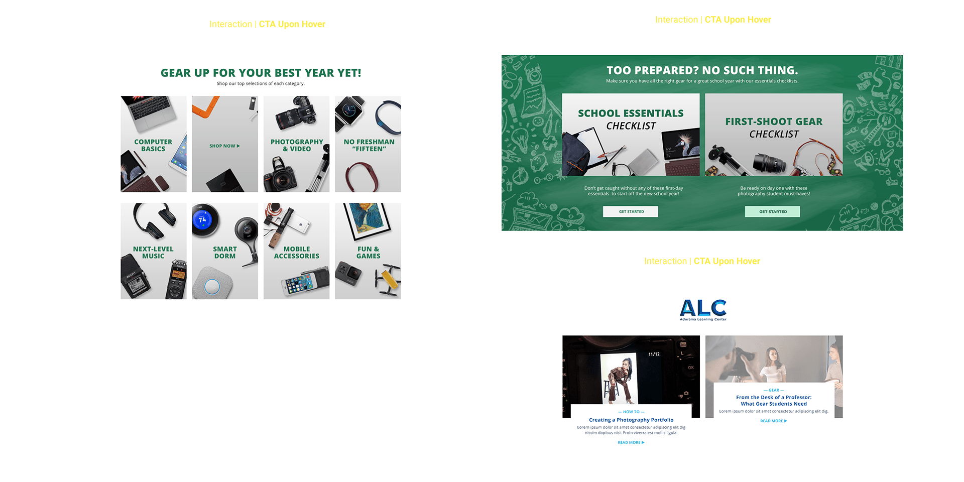
Once I settled on the finesses of the new wires, I began to think about the visuals. I went with a chalkboard theme for the primary look of the campaign. I thought It added a playfulness while immediately indicating to the user, this was all things Back-To-School. I carried the elements of Green and Light Gray down through out the experience. I played a lot with our product images, extracting them from white backgrounds and arranging them to appear as more of a stylized letdown.
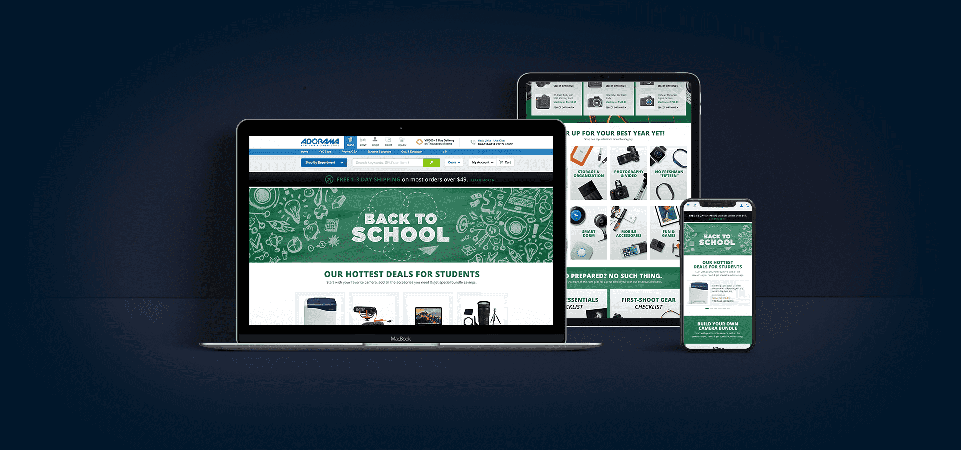
Below are the high-fidelity comps for the desktop and mobile experiences.
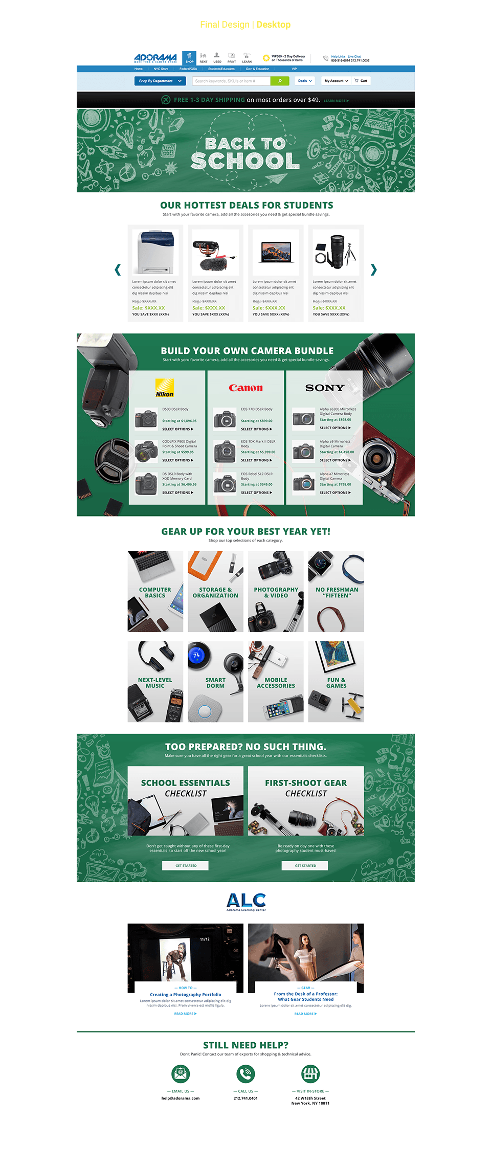

I incorporated slight animations (product imagery pushing outward, with category disappearing to reveal "Shop Now" eta) on the category cards that would highlight a selection on hover (and bring a bit of delight to the user). Because the primary sales promotion would be the "bundles" toward the top of the layout, I thought I would play with different calls of action for the content falling below—instead of creating a parade of buttons, all similar to each other. This helped establish priority and hierarchy for our intent of each block.
Below are examples of the hover states for the desktop experience, earmarked for a moment of delight.