OBJECTIVE 1 | Create a central hub for all channels to navigate toward for users to apply for the finance program;
OBJECTIVE 2 | Provide an introduction to the benefits and terms of the finance program;
OBJECTIVE 2 | Allow existing enrollees a place to login to their account (via our website rather than the bank).
This was a tight turn around of a project; if not mistaken, I received a brief on Friday; reviewed wires with the UX Manager on the following Tuesday, and submitted the high-fidelity comps by Thursday, EOD. The following Monday, the page was in-production with developers.
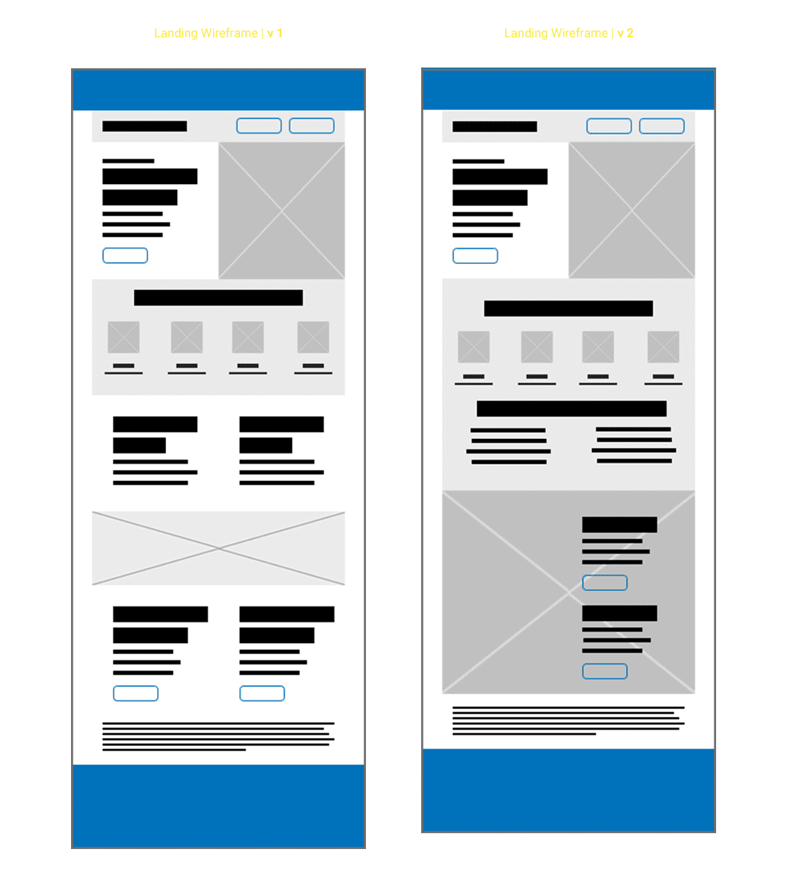
WIREFRAMES | Iterative Design
I did a bit of research into how a lot of brands (primarily direct-to-consumer brands within personal electronics) structure the flow of their finance options.
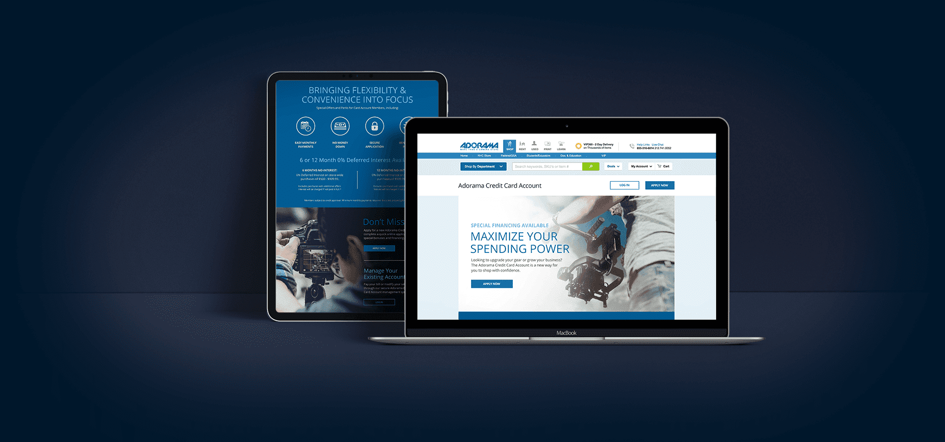
I quickly started laying out the content; structuring an intro and hero area that would serve as the primary area for the user to click through and go to the application process (hosted on the bank's site.) I also started to create a hierarchy of how to present the benefits in an easily digestible way.
Lastly, I took into account that the split of returning users versus new users would be along 85% (new) and 15% (returning). There for I created a tertiary block toward the end of the landing that would allow the user to apply (after reading through benefits) or login to their account.
Once I was locked into a structure for how to present the content (as well as incorporating "critical" business requests) I started to fully design the landing with our typical brand aesthetic. I played with color blocks to brake up the long scroll; I played with pre-heads and headers to emphasize where in the experience users were; I created iconography to add visual interest and break up all the copy points; and I brought in imagery that leaned more toward the professional/semi-pro customer we were primarily targeting.
Below is a high-fidelity comp of the desktop experience that went live in early-2018. (A true mobile experience wouldn't be developed until aftermy departure.)