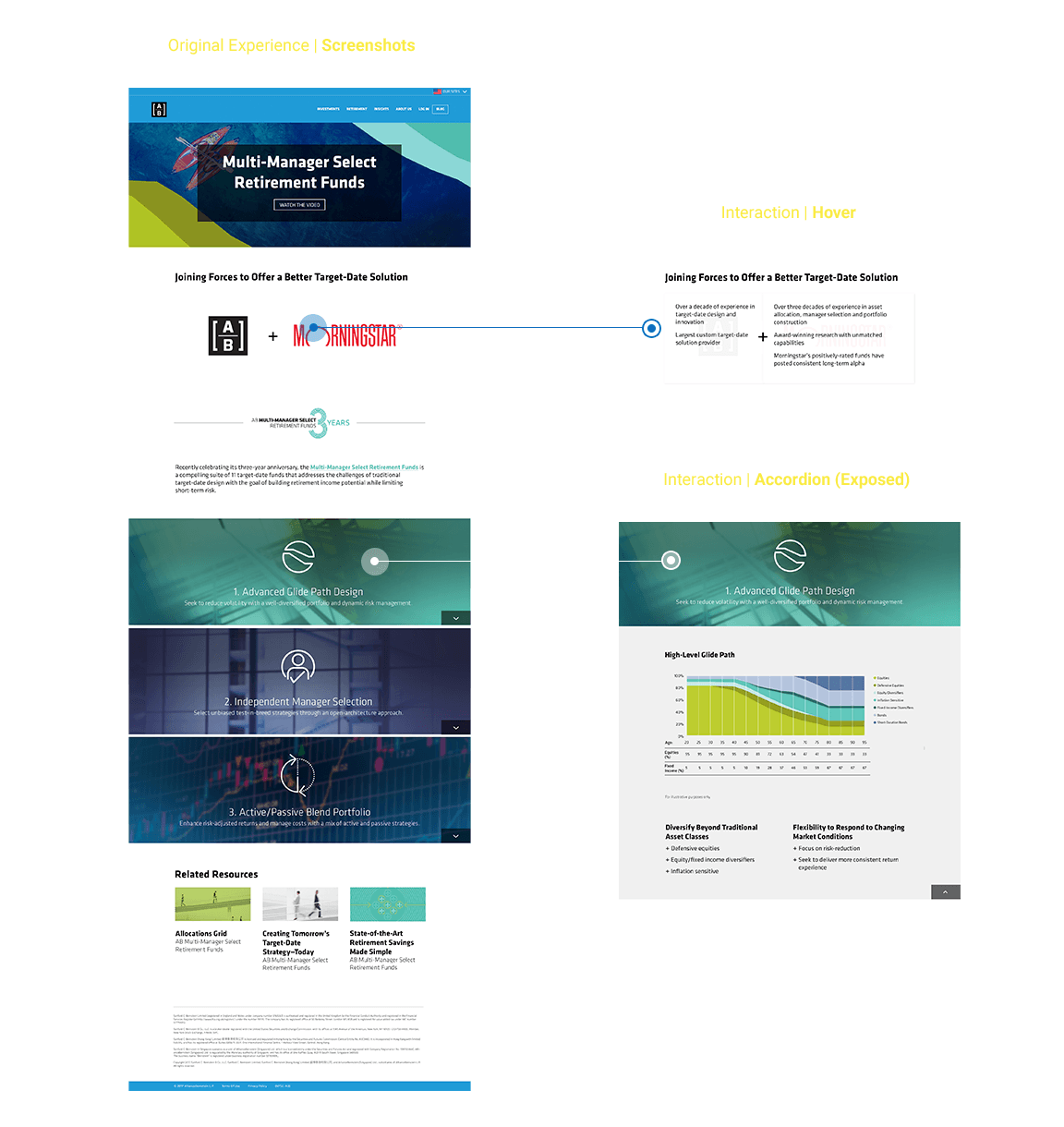
The first step of my process was working with the VP of UX to assess which layout, hierarchy and interactions were in need of improvement. The previous experience hadn't been designed by a digital-first designer. In the original experience, a bulk of pertinent content was hidden behind a hover-states and accordions, which prevented the users from quick scrolling in order to skim content (bc it required an additional step of the user each block of content).
After speaking with stakeholders and conducting internal user questioning and testing, we quickly determined the experience needed to be paired down to a simpler with less complicated interactions that better matched the content.
The first round of wires kept the bulk of the existing experience 's hierarchy, but included Cards that gave a summery of each section, as well as enabled the user to jump down to that block of content.
In my further iterations of the wires, I consulted with the product owner to better access their priorities and needs. New content was added (an introduction to the concept of Multi-Manager) and content that was being removed to make the experience more "evergreen" (chart displays). Further, we realized because a lot of the content was now a bit shallow, we completely removed the cards with jump navigation, which was repetitive and unnecessary interactions.

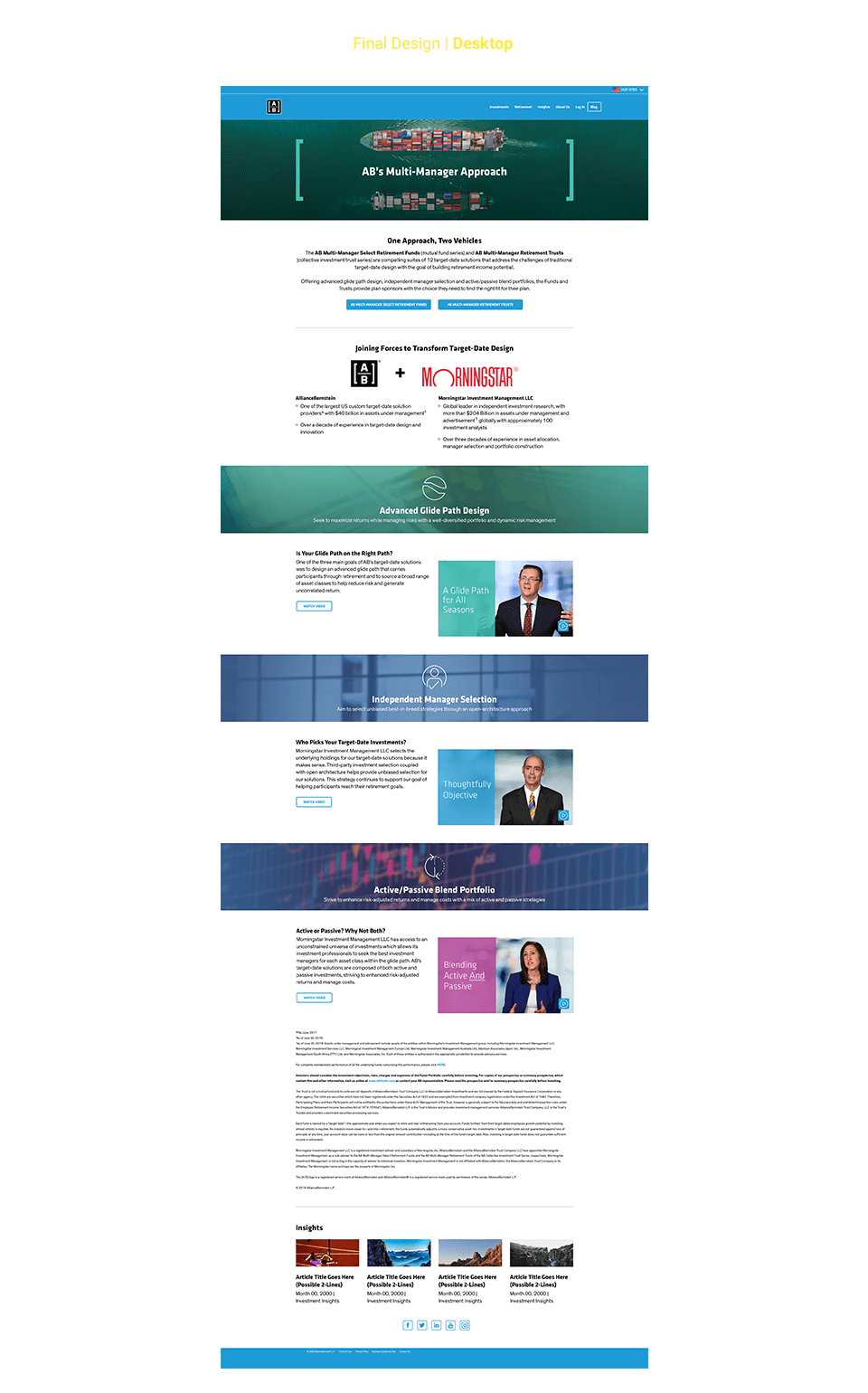
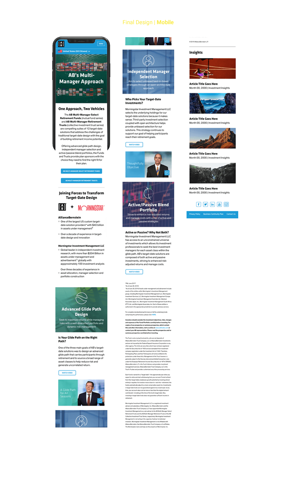
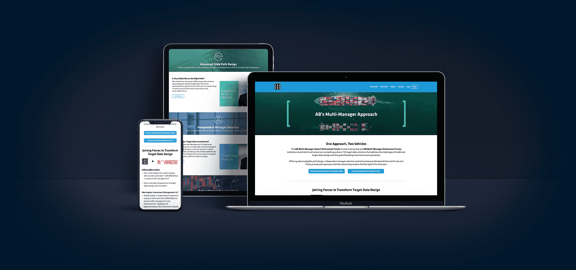
As seen, I created a cleaner, more streamlined landing page that allowed for each pocket of content to stand out in its own right. I moved brief explanations into the header of each section; I updated imagery to more closely align with our brand aesthetic; I created more hierarchy and structure to the way copy blocks were laid out to better let the user digest the landing page more readily. These improvements also allowed for a more mobile-first experience, improving on the clunky and confusing interactions of the previous experience.
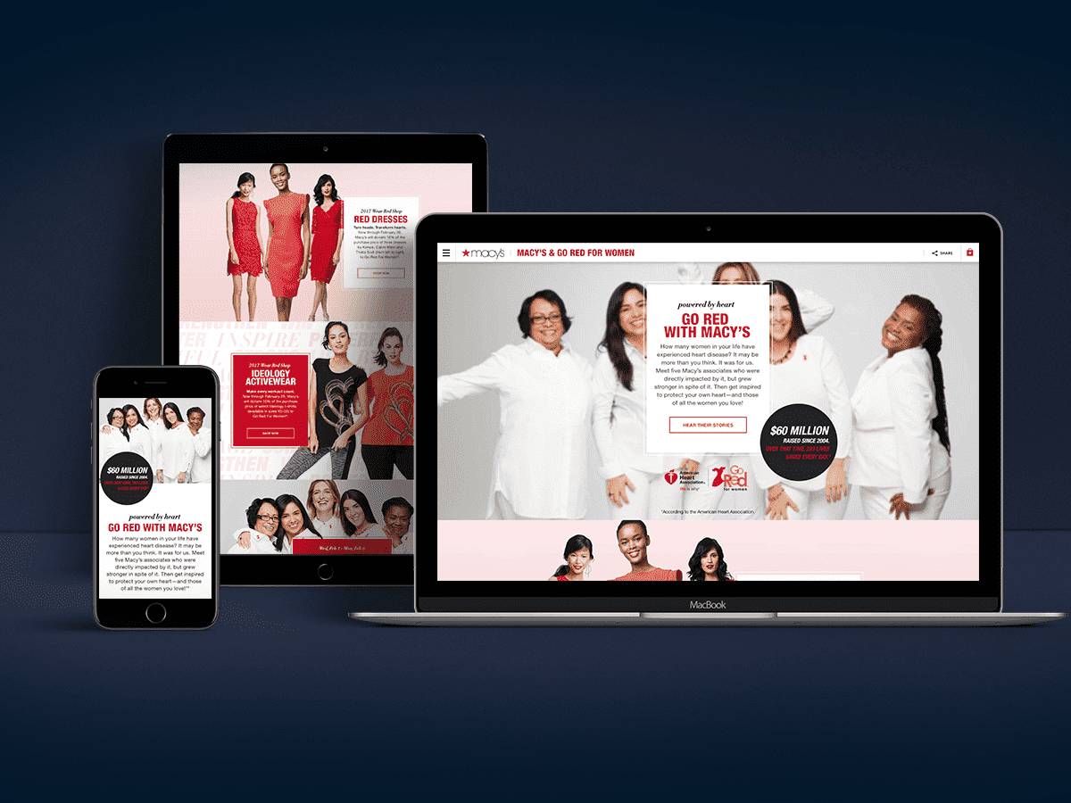
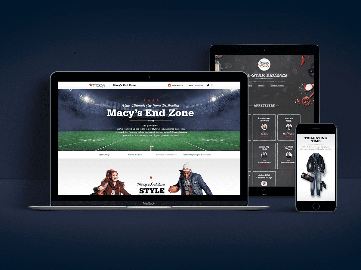
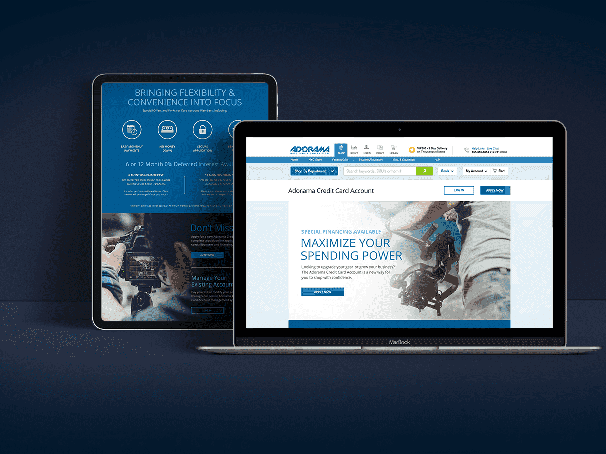
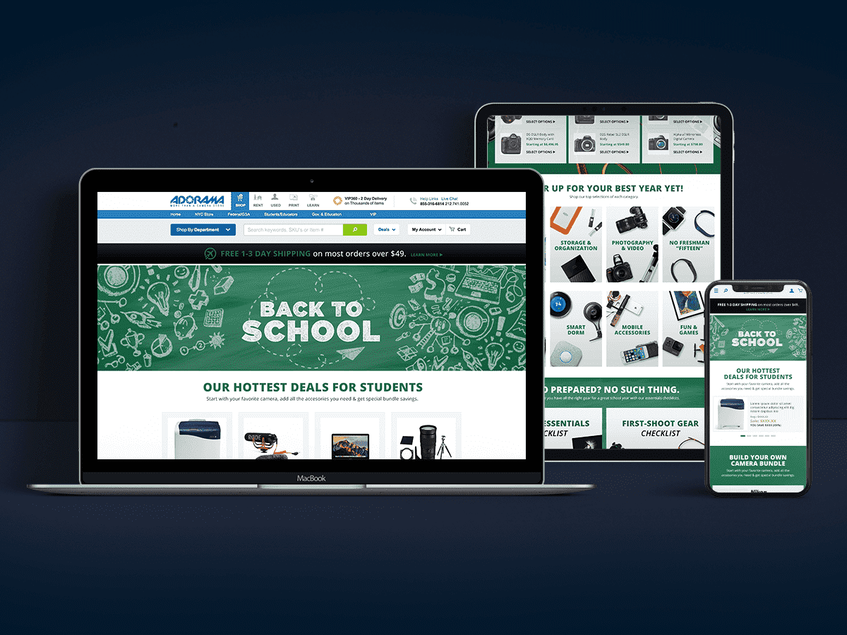
Below are high fidelity comps of layout for Desktop and Mobile experiences.