Problem Statement
The digital catalog experience lacked consistency across platforms, creating friction for users and inefficiencies for the team. At the same time, the Responsive Web (RW) site was migrating to a new framework — a perfect opportunity to apply and extend our design system for maximum impact.
Project Scope
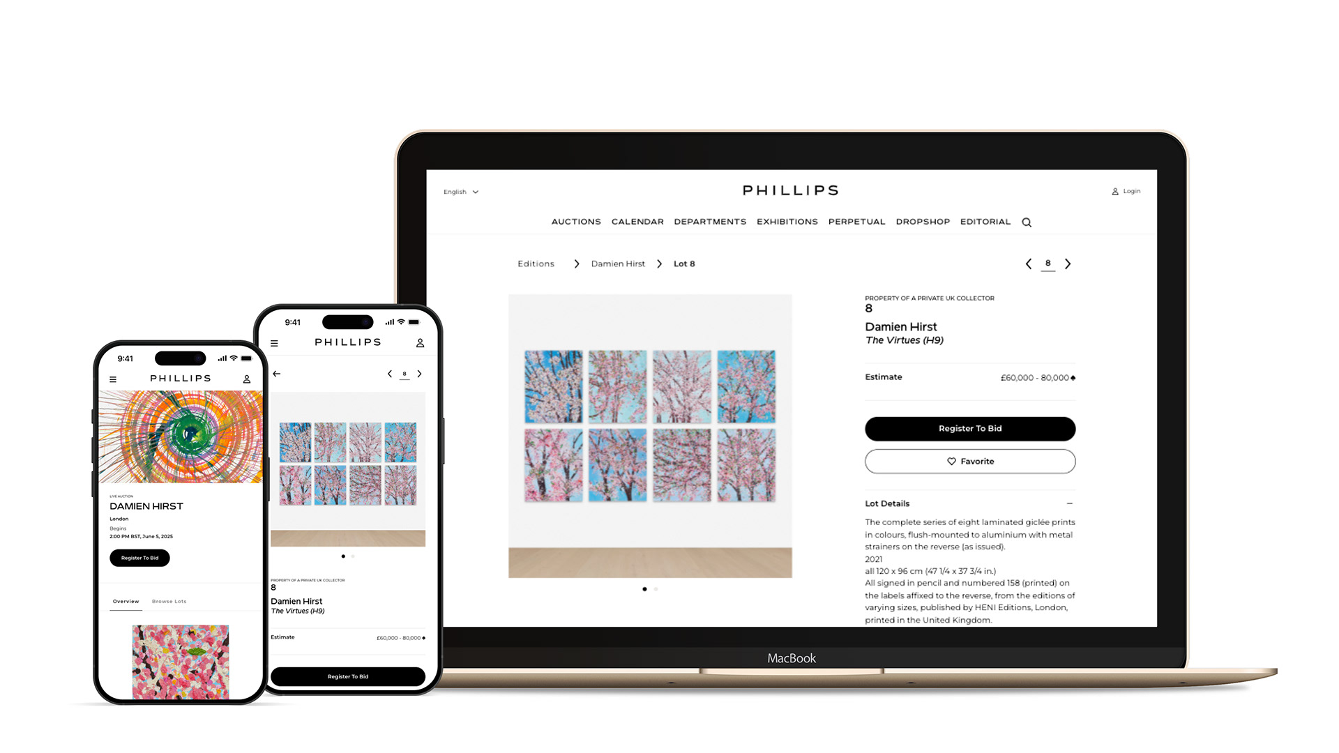
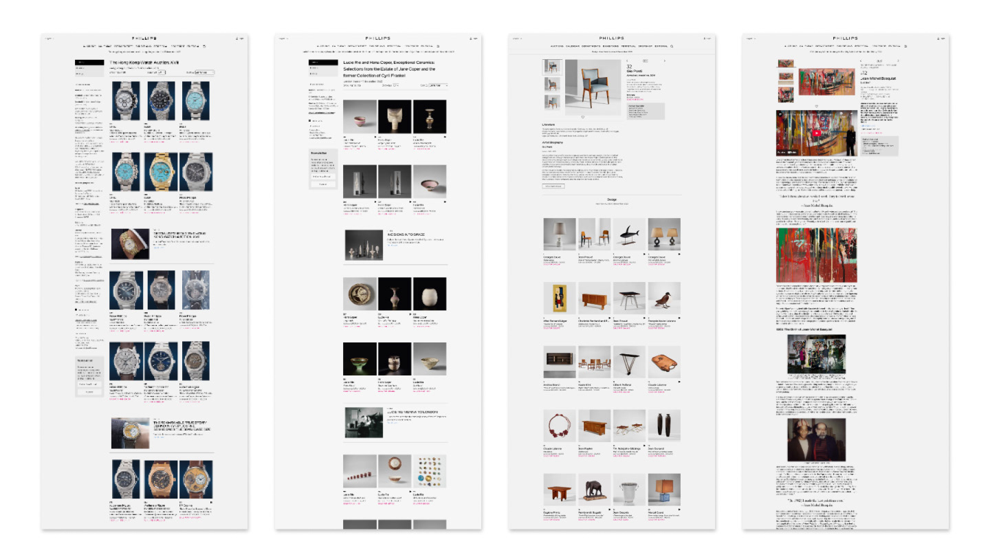
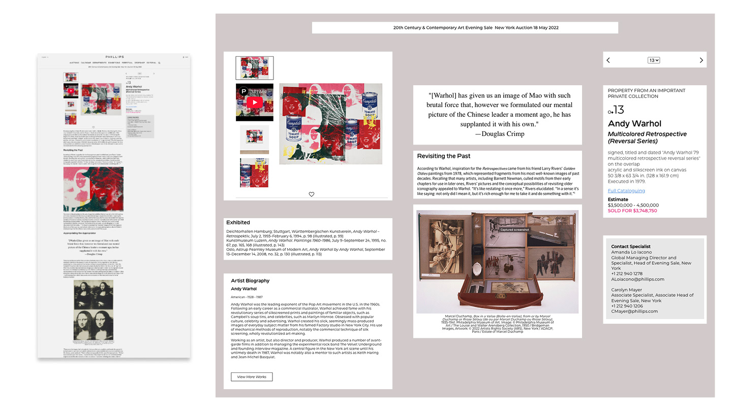
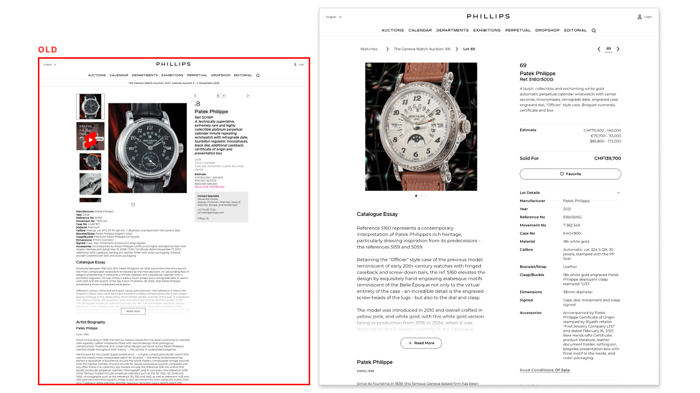
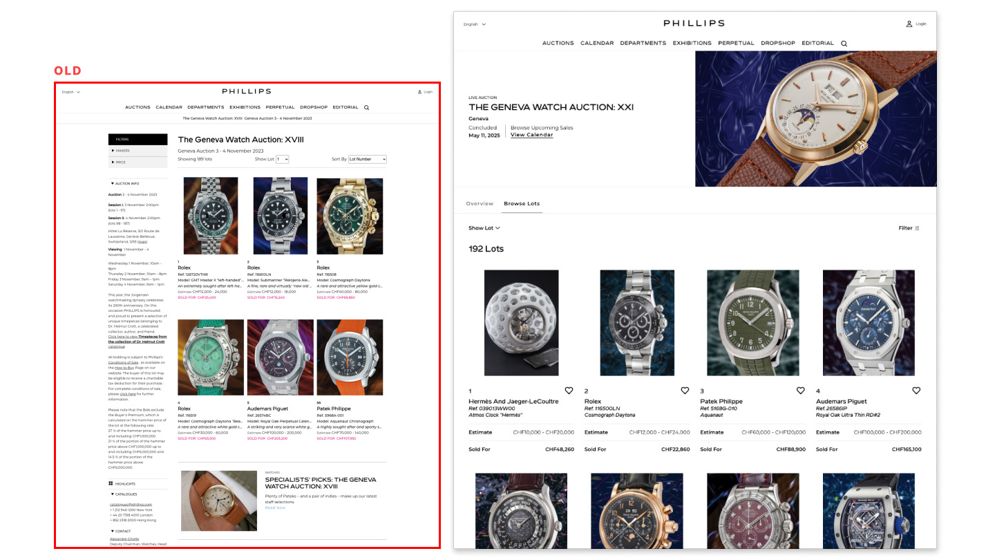
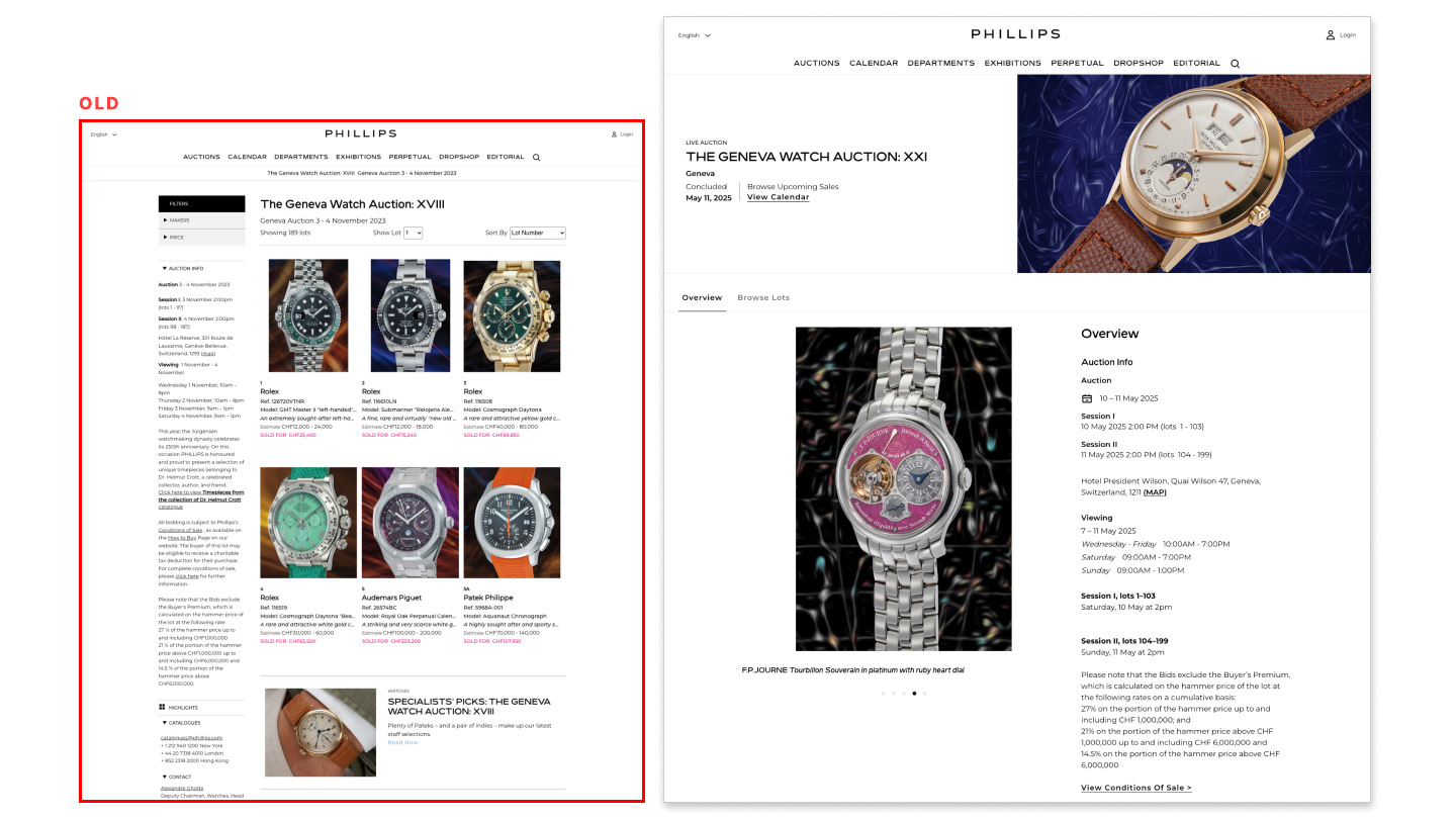
Alongside the platform migration to REMIX, I was responsible for redesigning the Auction Listing and Lot Description pages using our new design system. The goal: elevate the digital catalog and establish system parity with native apps.
ENVIRONMENT
With the decision to discontinue physical auction catalogs, all eyes were on digital. This shift brought urgency — and attention — to delivering a polished, performant online catalog experience.
The Situation
The Task
My Role
As Lead Product Designer, I spearheaded the redesign of the Auction Listing and Lot Description pages — while simultaneously developing and applying our custom design system, EASEL.
My Goal
Systematize the catalog experience to enable faster future iterations, support platform migration, and create a content structure that felt both luxurious and easy to navigate. The focus was on clarity, hierarchy, and breathing room in the UI.
CHALLENGES
We had a tight 6-month timeline and were building in parallel with the company’s new bidding platform. Additionally, the tech team was rapidly scaling, which meant onboarding new engineers while actively shipping.
Research, Ideation & Design Process
Site & Competitor Teardowns
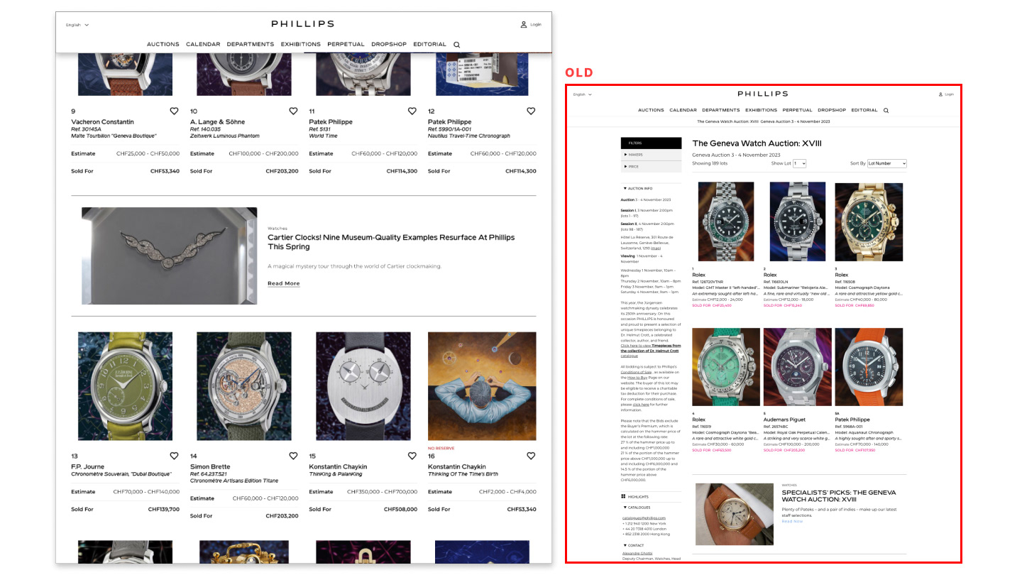
My team conducted deep teardowns of our own catalog pages across all six departments to identify where our templates broke under content strain. We also mapped competitor content and features to benchmark industry standards.

Internal Interviews
Due to the sensitivity around auctions and bidders, we conducted internal interviews with key stakeholders — “front-line” specialists who had close relationships with clients. While not a direct user lens, their insights gave us valuable context around client needs, consigner expectations, and common friction points.
the team and I validated early hypotheses and wireframes with C-suite and department leads — gathering directional feedback and aligning designs with business priorities.

Data Insights
Limited analytics and tracking setup meant we had to get creative. Our Data Scientists helped to scrape what we could from Google Analytics and review heatmaps from Hot Jar, spotting patterns like user drop-off and rage clicks to form hypotheses about UI pain points and usability issues.
DEsign MODE
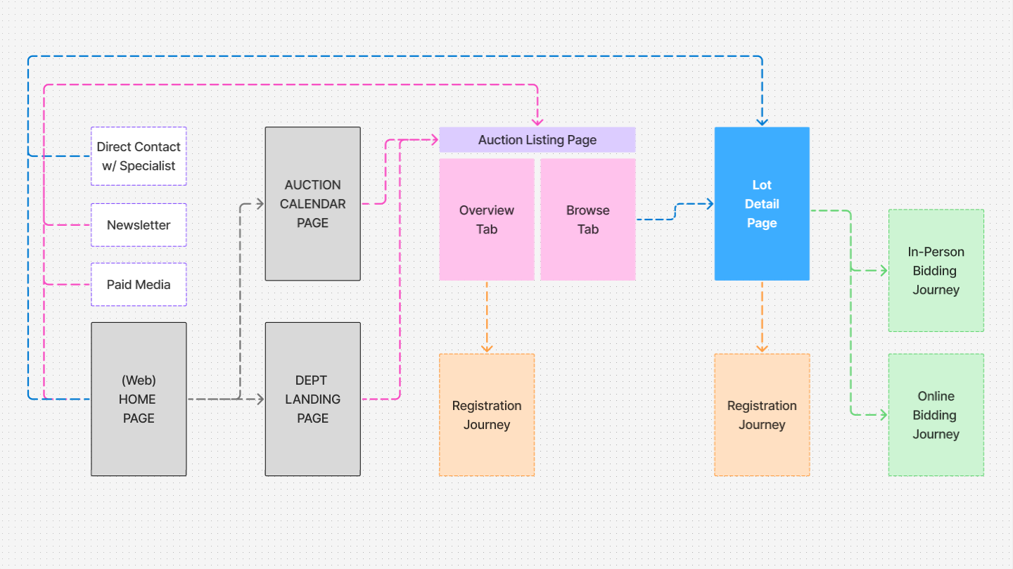
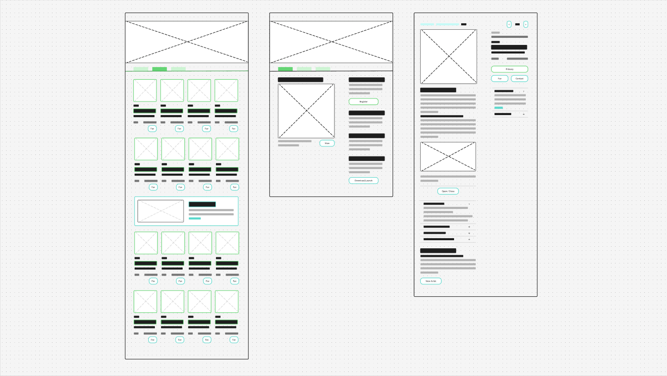
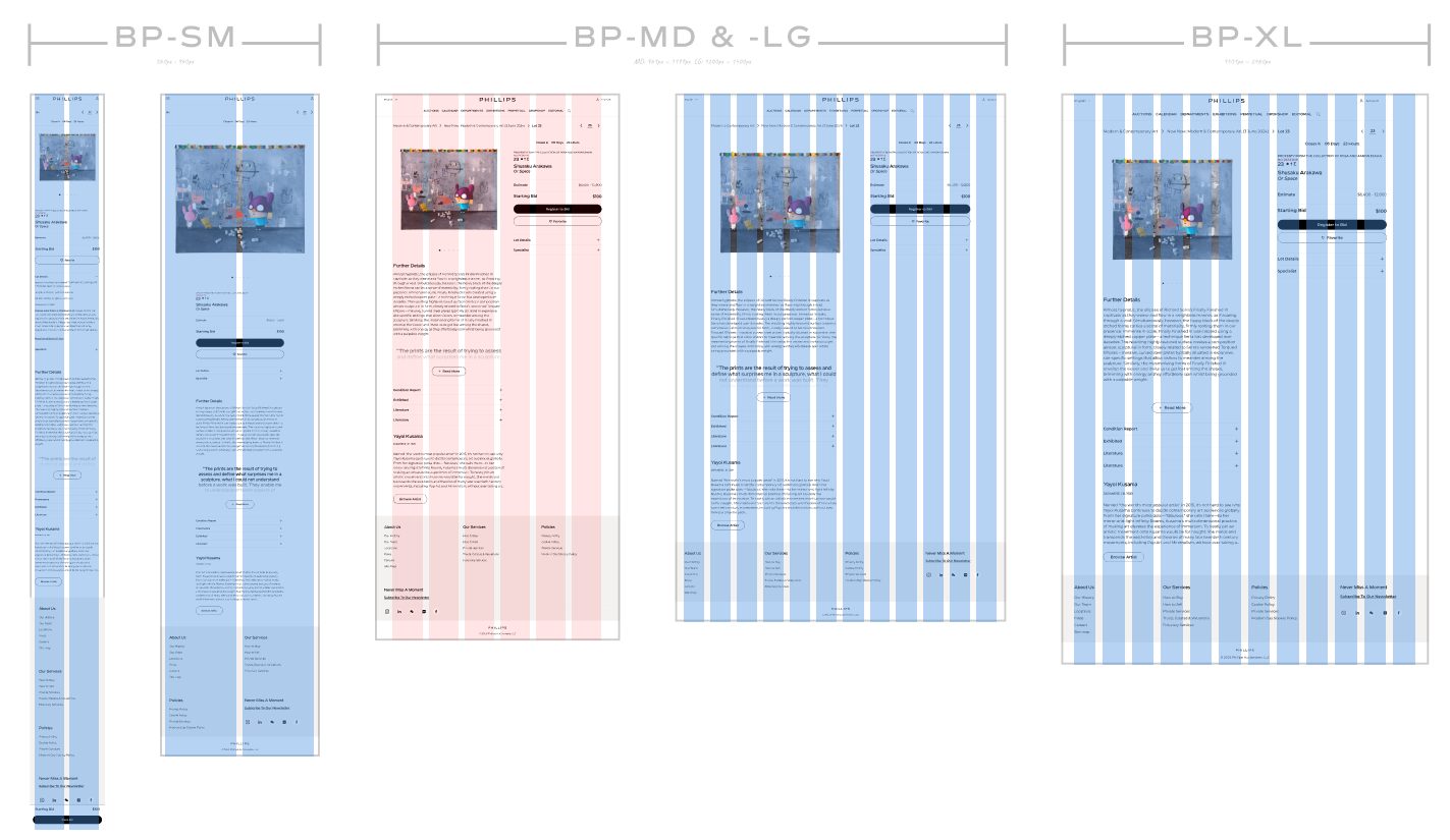
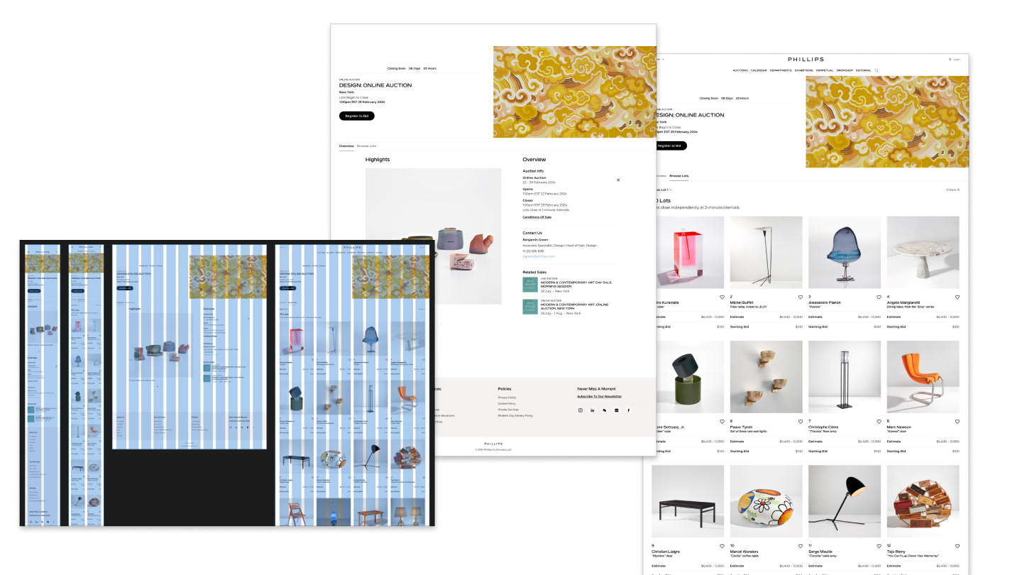
We mapped the full responsive journey, then moved into low-fi wireframes, quickly layering in findings from the concurrent design system work.
Designs were iterated in rounds, with regular stakeholder reviews and pivoting where testing invalidated assumptions.
Using live content, I built hi-fi prototypes that allowed us to stress test layouts against real-world content across departments. This surfaced key opportunities for content variations and led to the introduction of t-shirt sizing models for flexibility.
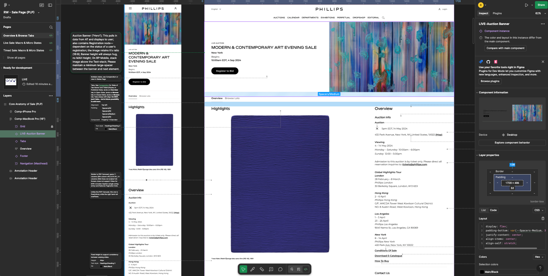
Once the structure was stable, I documented page micro-states and variation matrices to support development handoff and scalability.
Collaboration
I partnered closely with engineering to troubleshoot framework constraints and ensure clean handoff into SELDON. With product managers, we defined MVP and post-launch phases in alignment with auction publishing schedules — ensuring departmental needs and timelines were fully accounted for.
Motion & Interaction
Working with our junior designer, we used Protopie and Rive to define the motion of micro-interactions — including hover states, accordion behavior, and carousel transitions. These specs were lightweight but helped us bring subtle motion into the system, making the experience feel more premium and polished.
Documentation
I built out foundational documentation using FigSlides, outlining key patterns, design conventions, and rationale. This served as onboarding material for new designers, engineers, and producers, ensuring the system could live and evolve beyond launch.
Tools & Methods
Figma: Central hub for all design, prototyping, and documentation. Used FigJam and FigSlides for collaboration and clarity.
Miro: Used for teardown mapping with the Head of Design and UX Researcher.
Protopie & Rive: Collaborated with our junior designer to define and hand off motion specs — including carousel transitions and pattern interactions.
Device testing: Built prototypes across breakpoints to validate motion, interaction, and layout under real-world conditions.
The Results
Team Impact
Junior designers cut production time in half on BAU work by leveraging systemized components.
Native app teams reused 75% of mobile patterns, freeing up bandwidth to focus on broader app design.
Product managers were able to clear UX debt more quickly, replacing hotfixes with proactive design-driven releases.
Leadership Buy-In
Post-auction, specialists shared direct client feedback praising the transition. Users noted improved sectioning, better accessibility, and a smoother browsing experience — particularly on the Auction Listing page.
Metrics
The new catalog experience drove a 4% increase in digital registrations year-over-year within the first 60 days post-launch — a strong signal that the redesigned self-service flow was working.Post-launch, we reduced our design backlog by 30% in just two sprints, thanks to faster iteration and clearer component reuse.