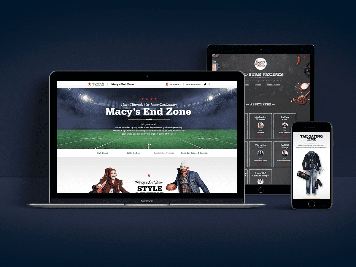
OBJECTIVE 1 | Create central hub to promote all cause initiatives, including: sale and merchandise;
OBJECTIVE 2 | Promote and host the broadcast of the celebrity fashion show;
OBJECTIVE 3 | Educate on heart disease via stats, real-life experiences with heart issues.
This micro-site needed to combine all the various facets for this campaign, that spanned approx. 2 months, launching with an awareness campaign and ending with a broadcast of the annual fashion show. This particular experience needed the flexibility of prioritizing the different initiatives at various phases. For example, the sales component needed to be most prominent in week 3, where as by week 5, it was completely gone from the experience and the broadcast details needed to be the top priority.
We solved for this by designing each section as a module that can be moved up or down dependent on the current phase.

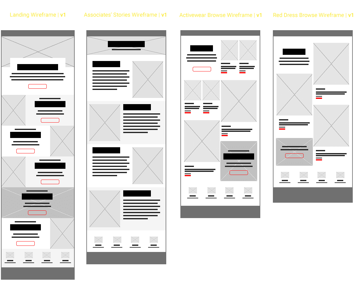
WIREFRAMES | Initial
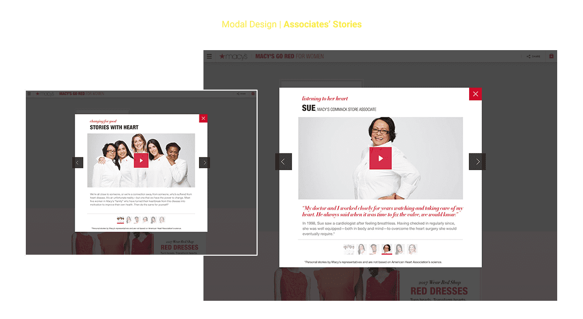
Originally, the experience was going to be more robust. I had anticipated a Landing, plus a few extra pages that would have housed Associates' stories, Merchandising and a page for the actual broadcast. After reviewing content with Marketing, we quickly realized that the experience would need to be scaled down, so as not to feel empty with the (ultimately limited) content.
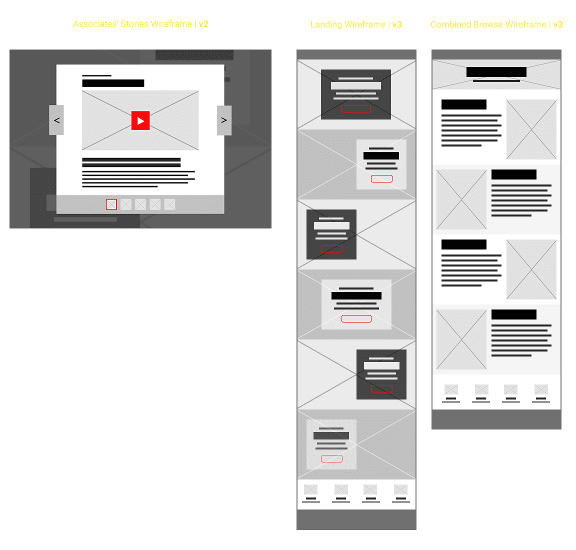
WIREFRAMES | Final Iterations
I streamlined the original zig-zag layout for the landing, utilizing full-bleed image backgrounds with card overplayed. We lost the page devoted to Associates' stories, and instead I created a layout for a modal that would house that content. We also merged the two separate merchandising pages into one, utilizing anchor points to jump to/and between the two collections. We also discovered that the broadcast of the fashion show would no longer be housed on our site, but on the Facebook page of the Heart Association, instead.
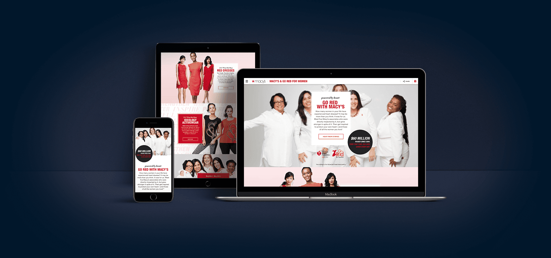
Below are the high-fidelity comps for the main landing experience on both Desktop and Mobile, including the Modal design for the Associates' Stories.


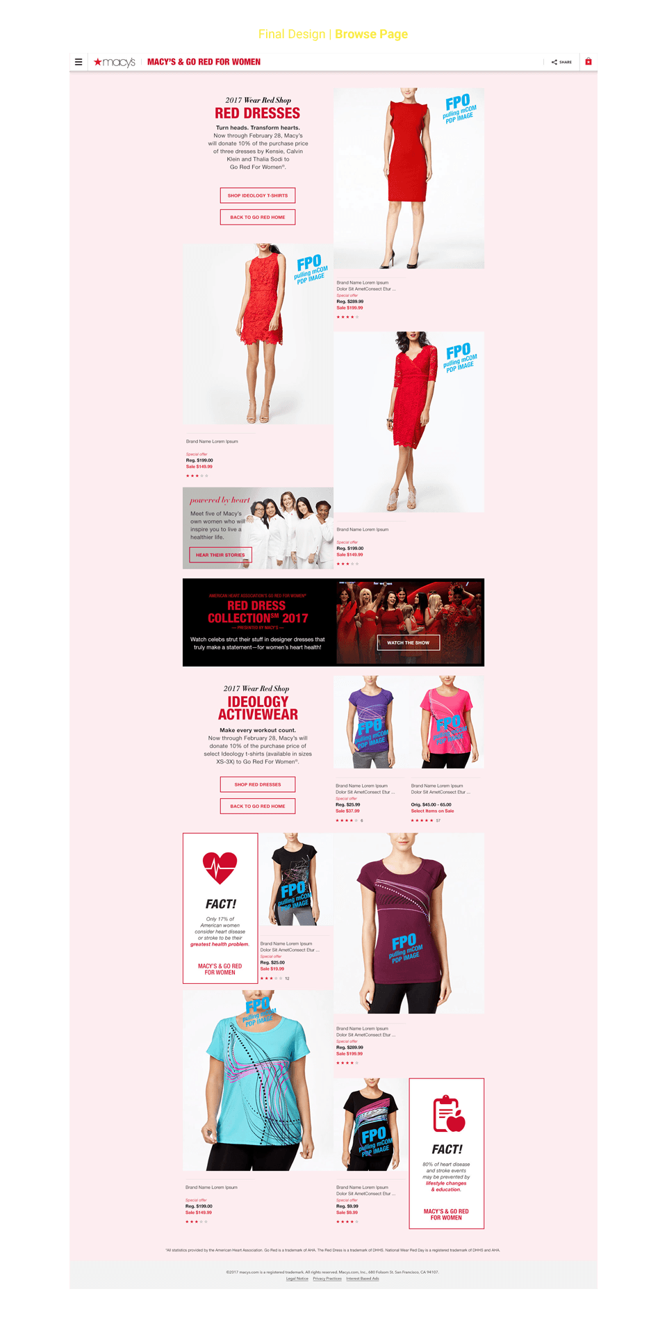
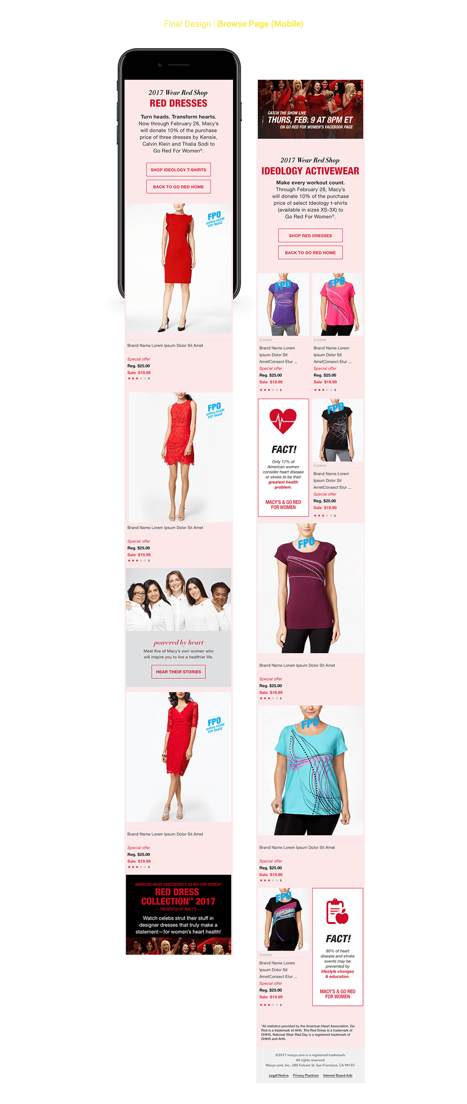
Below are the high-fidelity comps for the shop/browse experience on both Desktop and Mobile, including the hover state and Modal design for the product display & purchase.