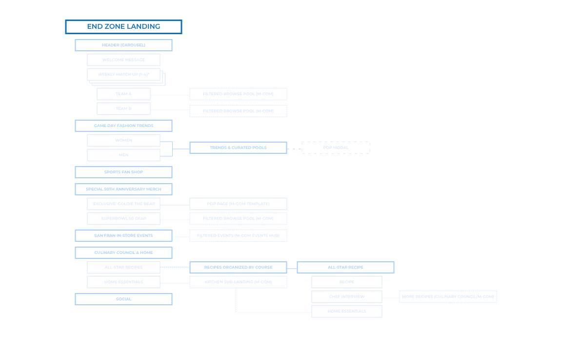
OBJECTIVE 1 | Create a central hub for all initiatives (Fashion, Home & Cooking) tied to Super Bowl;
OBJECTIVE 2 | Promote key trends with dedicated shopping experience around Football;
OBJECTIVE 3 | Promote Locker Room by LIDS (NFL merchandise) and exclusive merchandise (Goldie the Bear);
OBJECTIVE 4 | Expose local users to upcoming In-Store Events.
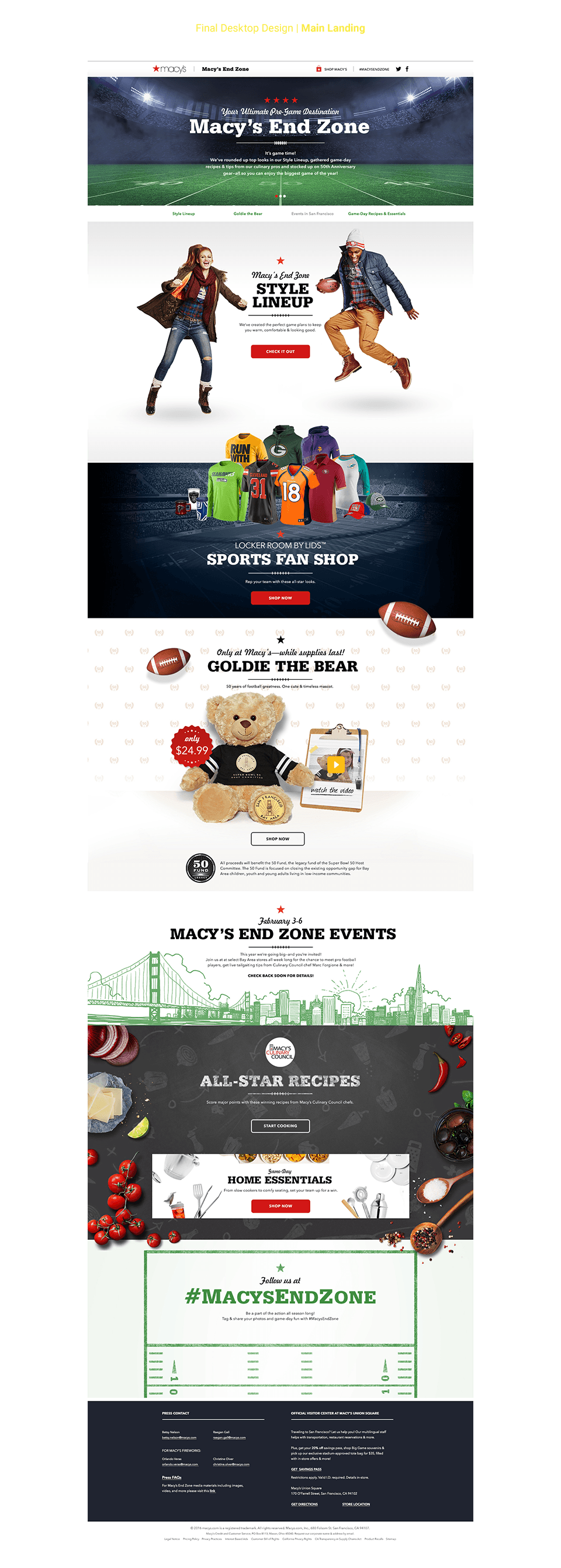
Traditionally, this type of experience was just a landing page with limited interactivity that would then funnel users into the various sections of the main Macy's site. But because this year was a big event, the idea was to create a lifestyle approach to emphasize how to get ready for the "big game" with Macy's. We wanted to leverage the Culinary Council to promote recipes that would spur users to shop home and cooking goods. We wanted to promote play-off teams' merchandise by creating a carousel that updated weekly and would take users to a curated product pool on Macy's main site. We wanted to easily navigate users to the Events Hub, so locals could see which in-store events were tied into the football campaign. We also wanted to create a shopping experience that would play up not only NFL gear, but also fashion trends and home goods. Below is the site map of the experience we developed.

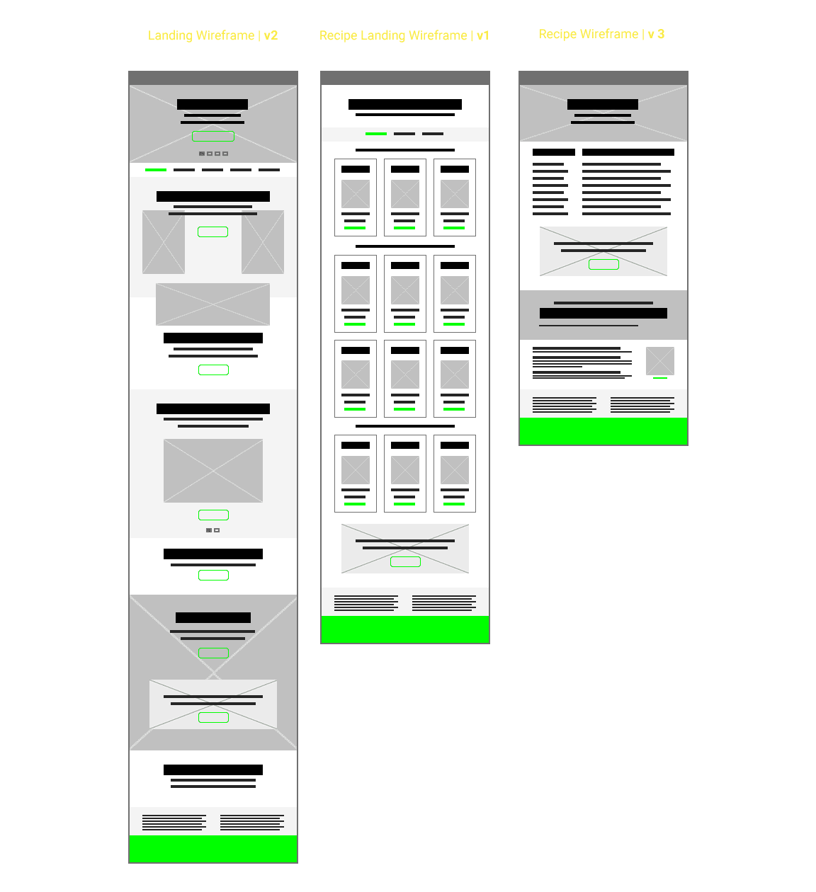
WIREFRAMES | Initial Layouts
The initial wires really focused on trying to get all the initiatives and content exposure on the site. We played with alternating blocks of content to expose the various merchandising pools. I created streamlined layout that would become the template for recipes. I designed an interactive shopping experience that would showcase the trends with stylized photography, but then expose actual SKUs just below.
WIREFRAMES | Streamlined Iterations
After a few iterative passes on the initial wires, I tried to add a hierarchy to the levels of content. Anything that was curated would have exposure within the layout cascading down toward the footer. I added some breath to all of the sections and utilized full-bleed and color blocks to differentiate each section.
We relegated generic merchandising pools to just the course, and allowed users to explore the unique shopping experiences by blowing out their exposure more within the layout. I also created a secondary landing, for the Recipes, to better organize and help navigate the user. We ultimately eliminated certain aspects of the experience, such as a social media component and curated pool of Cooking merchandise (instead, we just sent them off to the main site to browse and shop.)
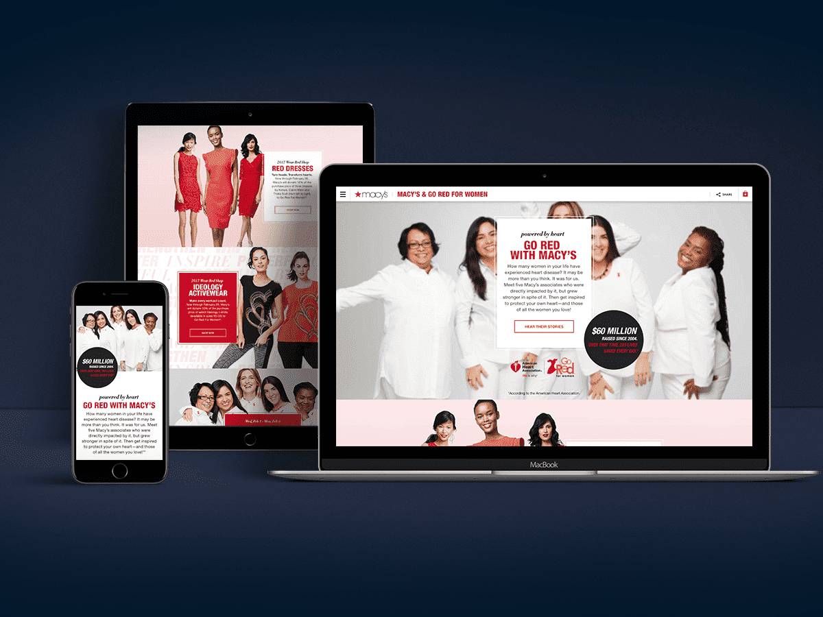
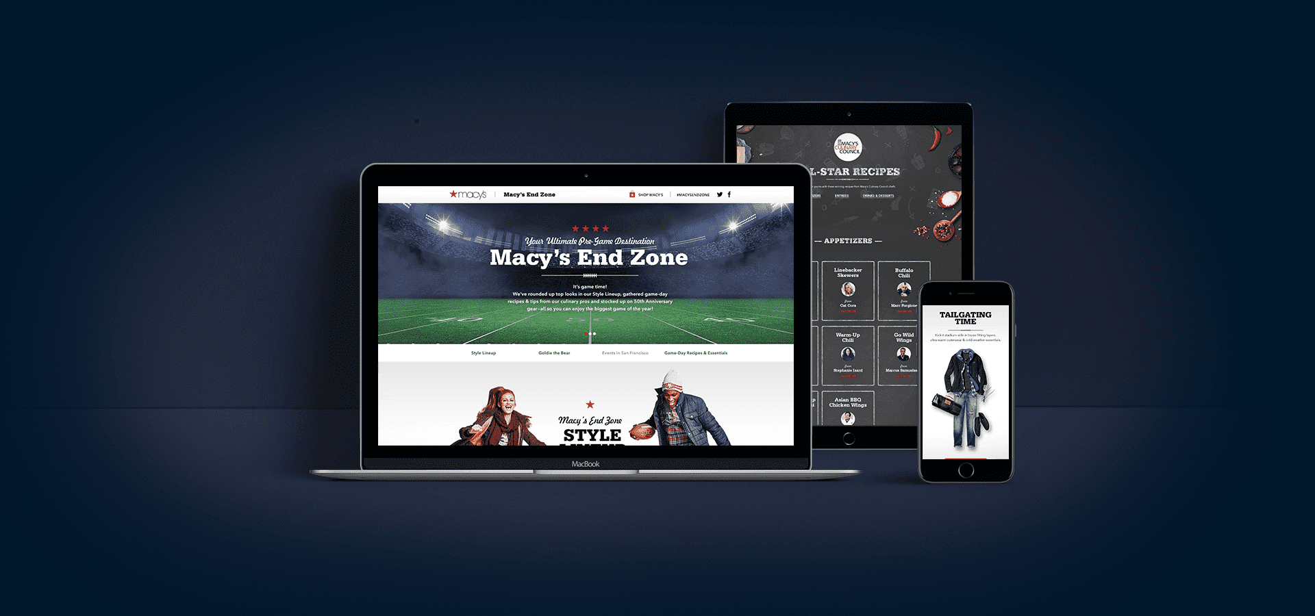
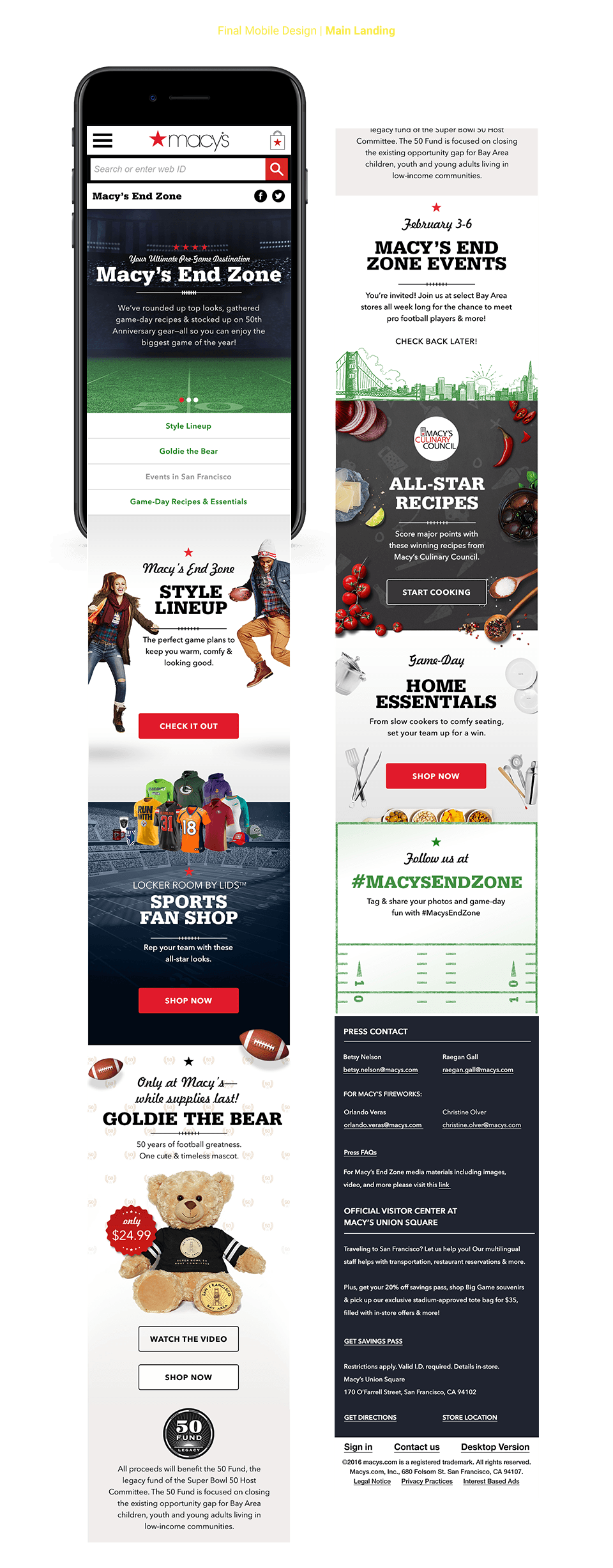
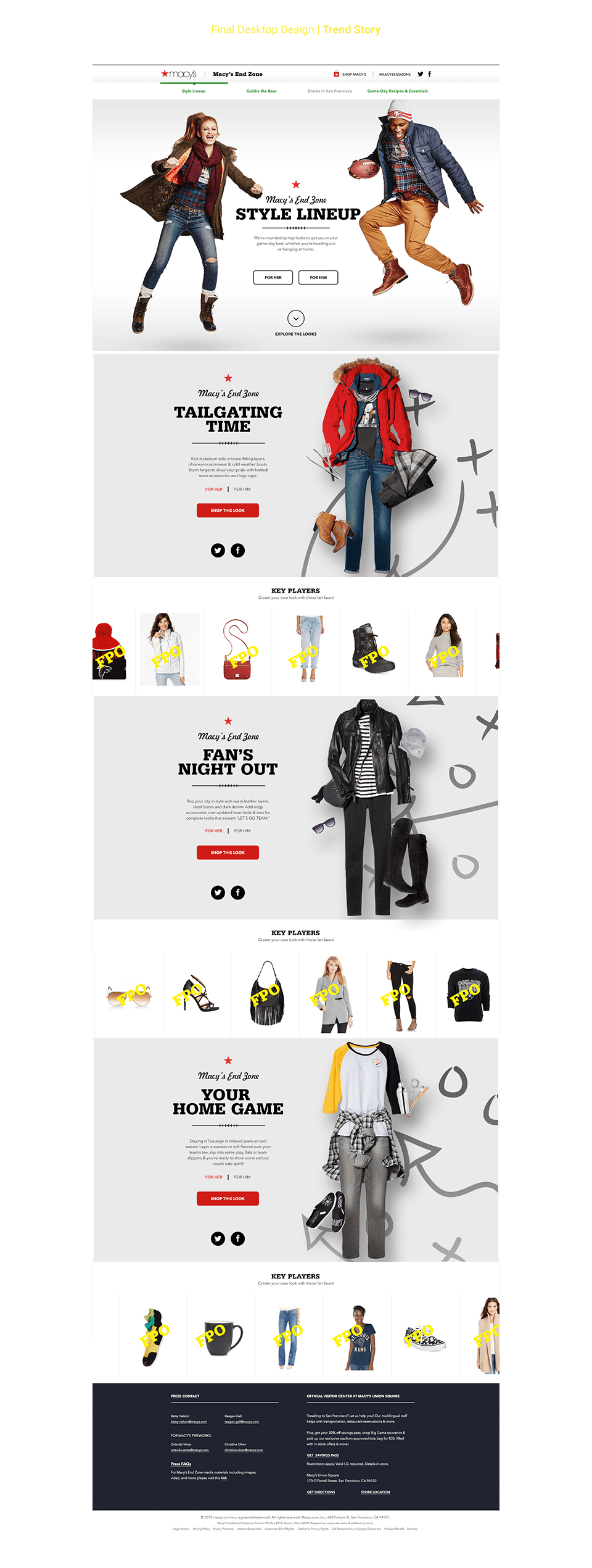
Below are the high-fidelity comps of the experience for both Desktop and Mobile. They showcase the breath of design we put into the site. I played with the established tool kit from the print teams, incorporating the display fonts and colors. I mixed in-house developed imagery (which I art directed with mood boards and swipe, before handing off to the photography teams) and mixed in stock-imagery as dressing. I was especially proud of the workaround I solved for utilizing NFL logos and teams; instead of trying to secure rights and approvals from the NFL, we utilized merchandise, such as jerseys, hats, mugs, and collectables that we sold on site to make it feel authentic to the NFL.
For the trends/shopping experience, I worked with the Creative Director to create a fun and interactive layout. Users would be able to toggle between "Men" and "Woman" to get tailored product pools that reflected each trend. We utilized parallax effects when a user scrolled to act motion to the models in the hero image and lay downs of clothing and gear in each trend section. Instead of multiple static rows of products, we made a continuous scrolls just below the lifestyle image that would stop when a user hovered on a specific image; if clicked, the user would then see a modal that allowed the user to get all the details and ability on a regular PDP page on the main site.

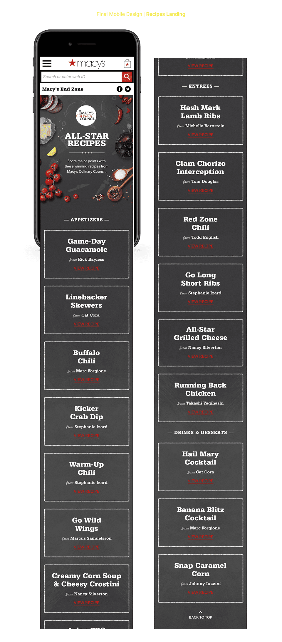
Below are the comps for the Recipes section of the experience. I created the landing to better organize recipes into Appetizers, Entrees and desserts—creation a visual hierarchy with type treatments that let the recipe title take prominence over the chef name.
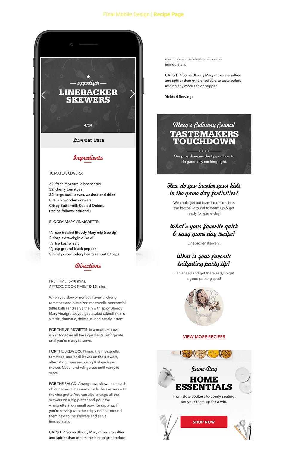
On the Recipe Detail Page, I tried to organize the ingredients and directions in a clear manner, breaking with the way we hosted recipes on Culinary Council sitelet. With the Chef interview, I played with the fonts from the tool kit, since this area could be a little more "display-eque" as opposed to the recipes above.