OBJECTIVES
1. Design an interface that enables users to easily explore the full product assortment available through e-commerce.
2. Educate users on proper fit while guiding them toward their correct size with confidence.
3. Highlight seasonal trends from print campaigns through curated product groupings.
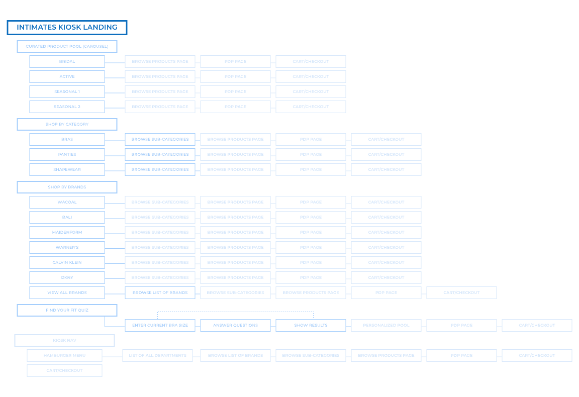
The experience map and user flow below illustrate how we structured the journey. Since the Endless Aisle technology was already in place to support shopping functionality, I was able to leverage existing UI patterns used across other departments (FOBs – Families of Business). This allowed me to focus my efforts on shaping the Quiz and Category selection portions of the experience.
WIREFRAMES | Initial Layouts
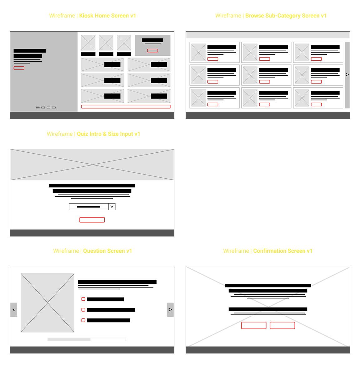
The UX Manager for in-store technology provided an early wireframe as a starting point. While helpful as a foundation, it was fairly bare-bones and created before final content had been developed. Key components—particularly the educational elements around fit—were missing, which meant we needed to evolve the layout significantly to support the experience we envisioned.
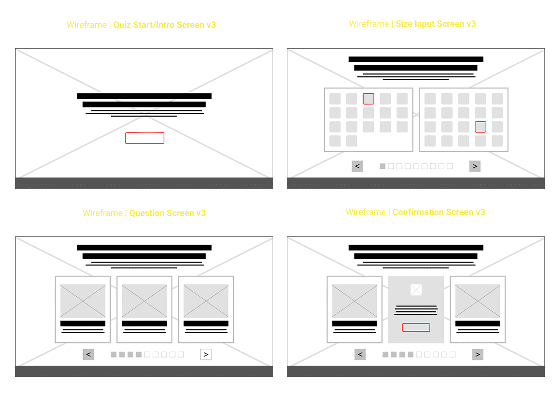
WIREFRAMES | Final Iterations
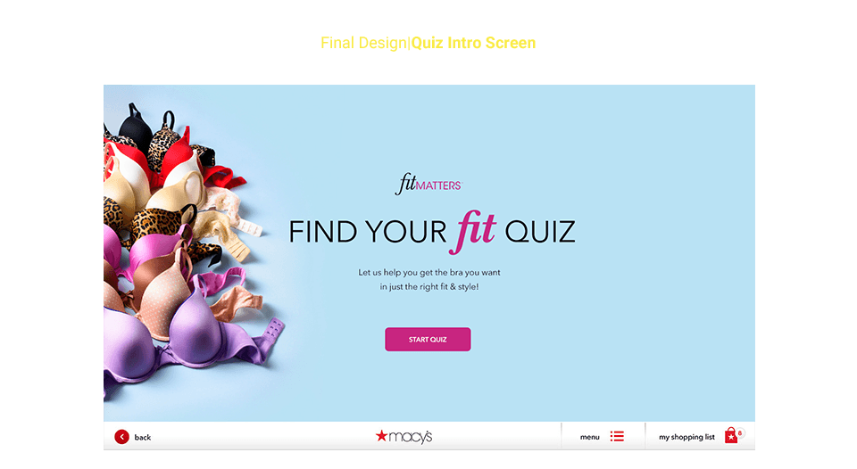
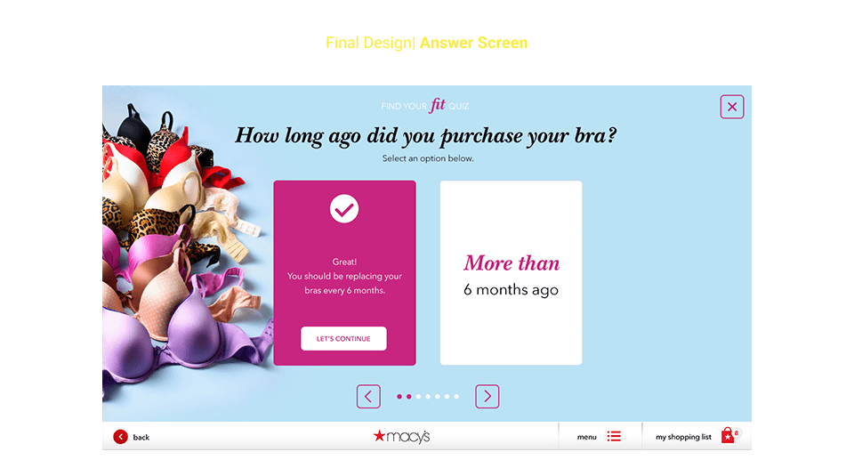
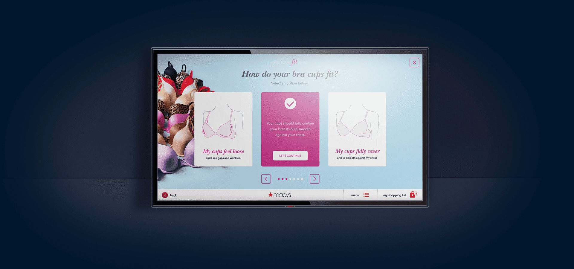
We had always envisioned the quiz as a full-screen experience, guiding users toward a personalized fit recommendation and curated product pool based on their size and preferences. However, we didn’t want the experience to feel transactional or incomplete—education around proper fit was just as important as the end result.
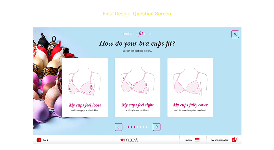
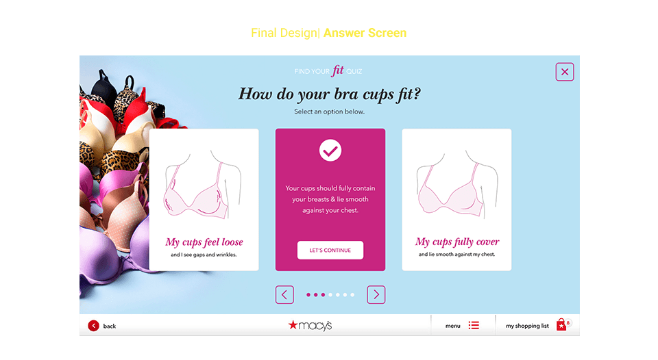
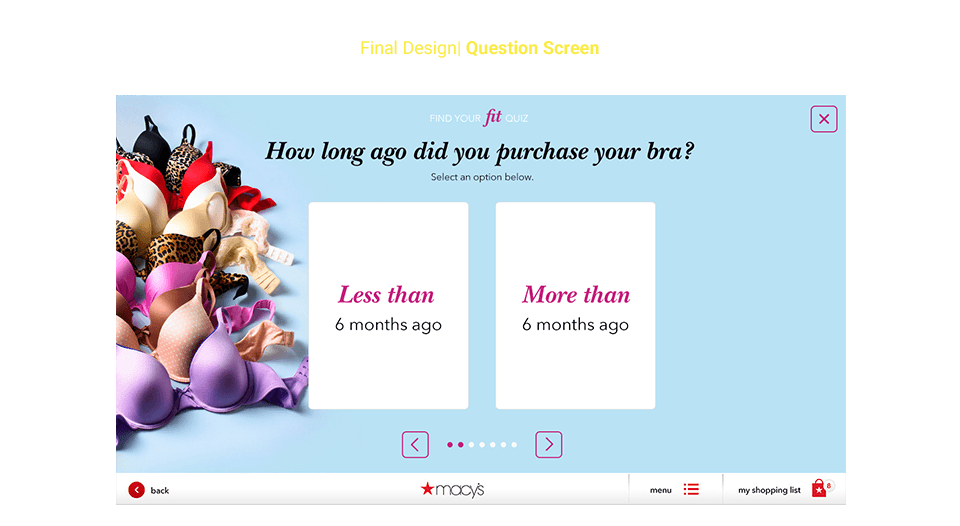
To strike that balance, we reimagined the wireframes to introduce a more thoughtful flow: starting with an introductory screen, followed by a simplified input for their current size. From there, the questions and answers were designed to dynamically respond to the user’s input—either confirming their current fit or clearly explaining why an adjustment might be needed. This approach helped create a more empowering, informative journey without sacrificing ease or engagement.
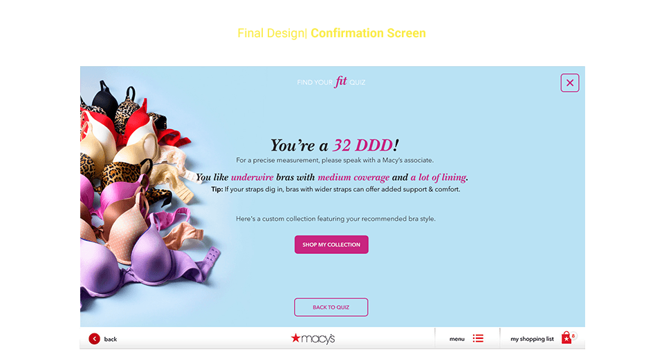
Once the final wireframes were approved, the next step was to visually design each screen—mapping out categories, product types, and common fit issues. I was able to leverage existing imagery from Macy’s print campaigns to reflect the brand’s aesthetic and showcase real merchandise wherever possible.
For areas requiring more nuanced detail—such as distinguishing between a thong and a brief, or illustrating fit issues like gaping cups versus spillage—I opted for a custom illustrative approach. I partnered with an illustrator to develop a consistent visual system that clearly conveyed each fit issue and product sub-category. Drawing on my background in intimate apparel, I was intentional about maintaining a respectful, approachable tone—avoiding close-up imagery that could make users feel exposed or uncomfortable. The goal was to educate and engage, not alienate.
Below are the high-fidelity comps for the Find Your Fit experience.
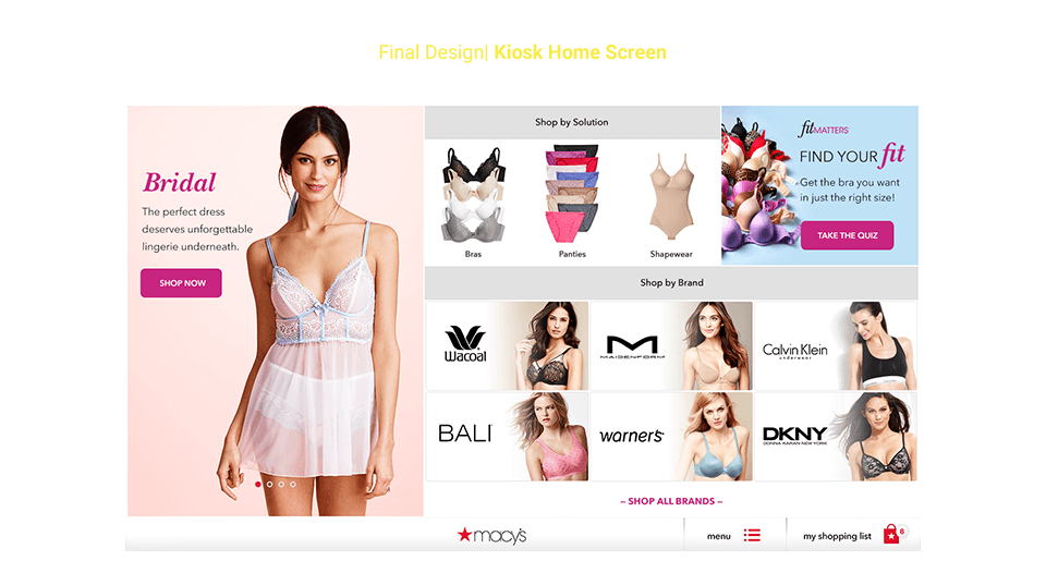
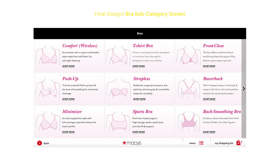
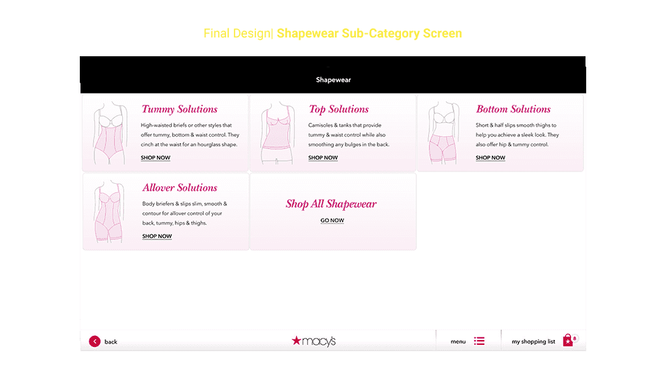
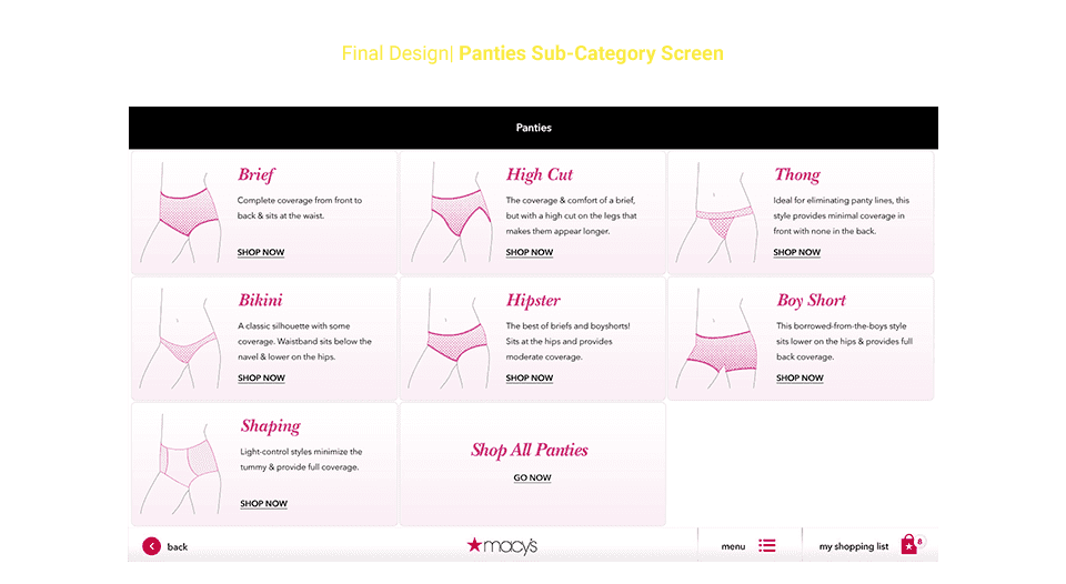
Above are the high-fidelity comps for the kiosk landing screen and sub-category pages, which feature the custom illustrations. Below are the screens users would encounter while progressing through the quiz experience.