OBJECTIVE 1 | Create an interface to allow Users to easily navigate full-assortment from e-com;
OBJECTIVE 2 | Educate users on proper fit while ensuring they are in proper size;
OBJECTIVE 3 | Promote seasonal trends from print initiatives with curated product pools.
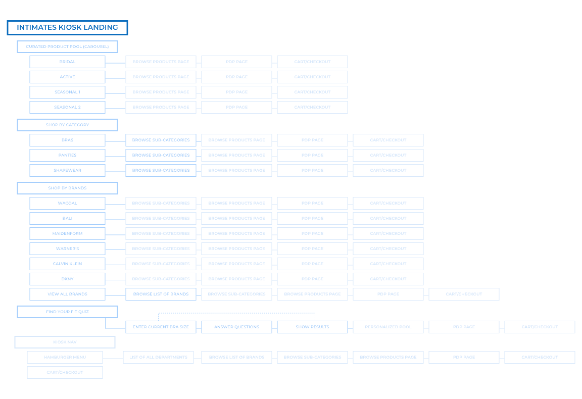
Below is experience map/ user flow. Because the Endless aisle was already developed technology, for the shopping elements, all I had to do was utilized the various patterns already established for other FOBs (Family of Business, or department) and focus on the Quiz and Category portions of the experience.
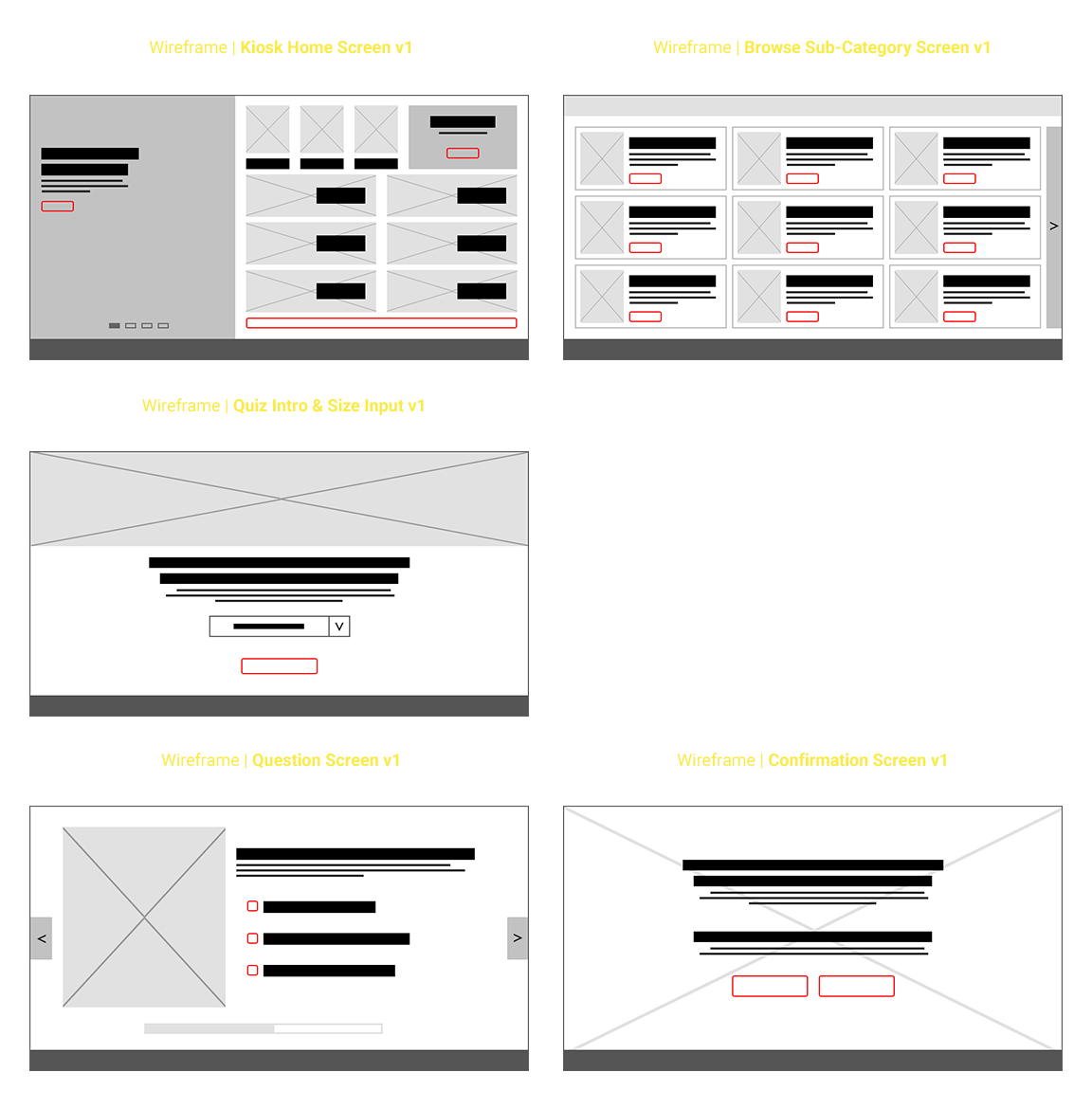
WIREFRAMES | Initial Layouts
The UX Manager of in-store technology had provided a rough wireframe to work from. It was pretty bare bones and was developed before the full content was developed. It lacked some components we had wanted to incorporate, like the important education aspects of the fit.
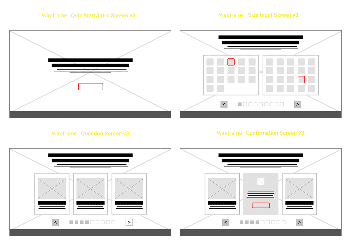
WIREFRAMES | Final Iterations
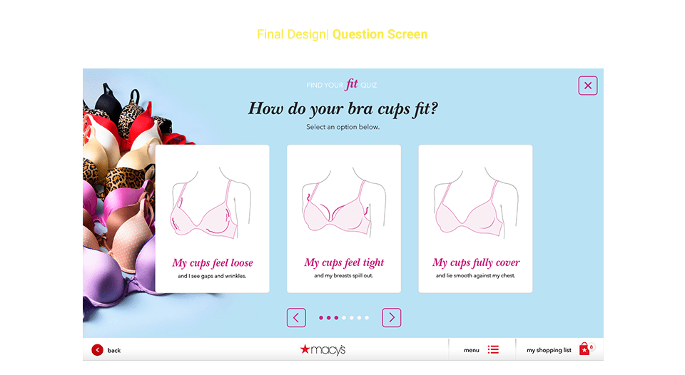
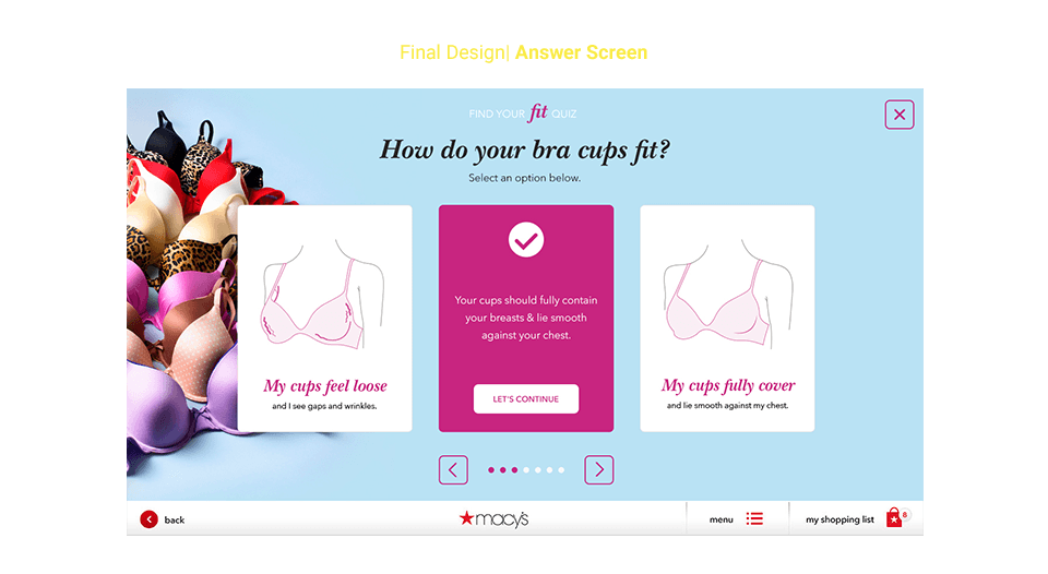
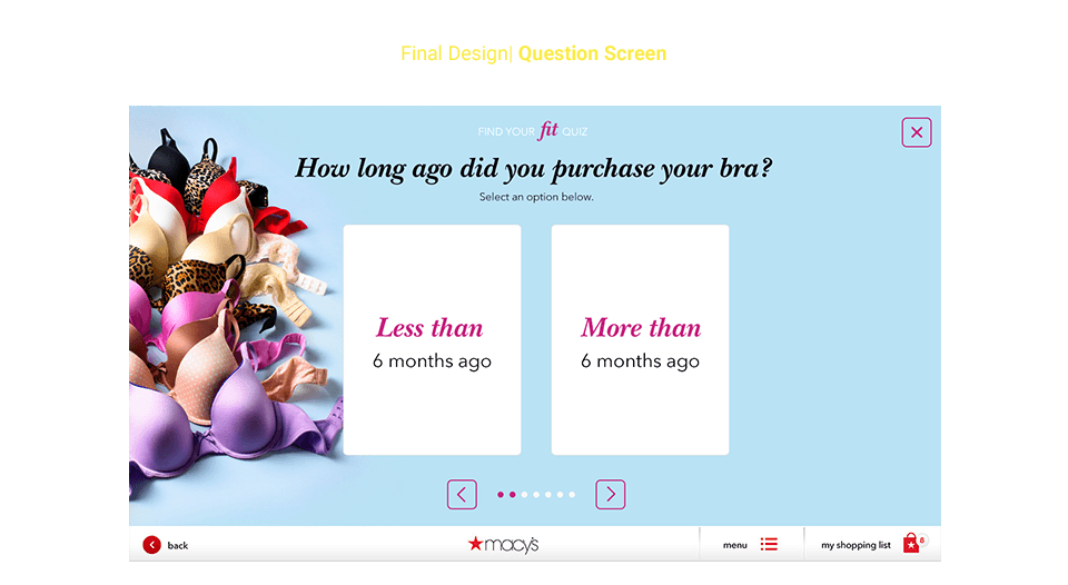
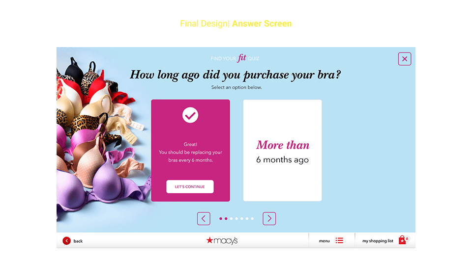
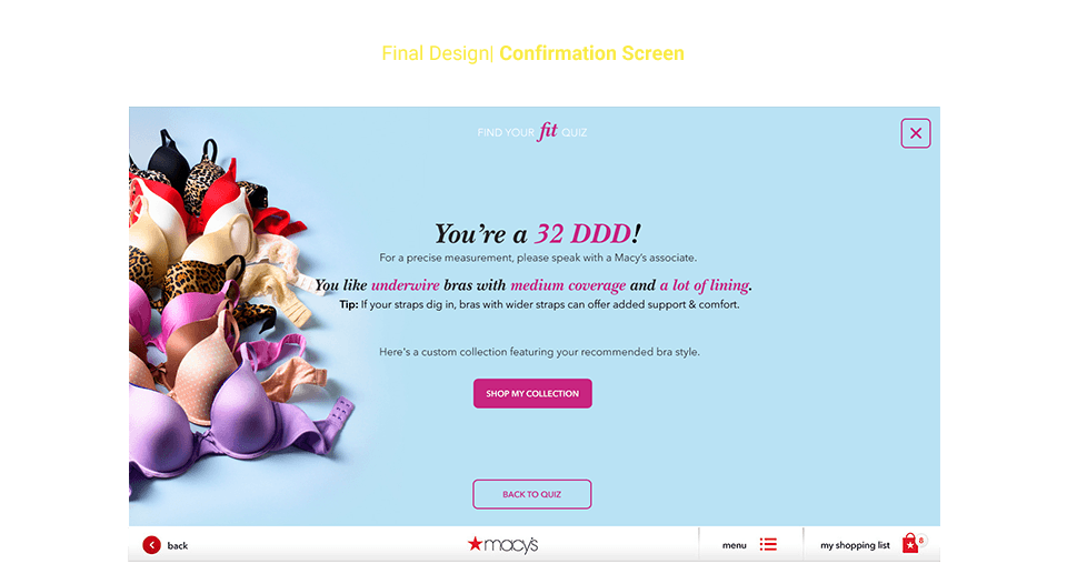
We had always envisioned the quiz being full-screen, with the user navigating to a final fit and product pool (customized to their size and preferences selected during the quiz). But we didn't want the experience to feel incomplete or lacking by not educating the user on the issues and proper fit. So we re-conceived the wires to allow for an intro page, followed by an easier method of inputing their current size, and then laid out the questions and answers to be reactive to the user's input by either confirming they're in the right fit, or explaining why they are in the wrong fit.
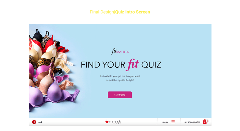
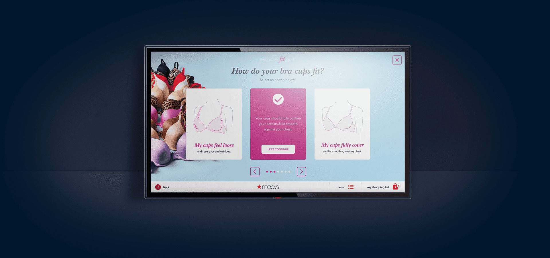
After settling on the final wires for the experience, the next task was to visually design each slide, each category and each problem/issue. I was able to leverage existing imagery that had been developed for other print projects, to showcase the Mcy's brand aesthetic and actual merchandise.
For the ares that would require intricate details to differentiate styles (i.e. Thong vs. Brief) or fit issue (i.e. loose cups vs. spilling out of cups) I decided to go the illustrative route. I worked with an illustrator to create custom and consistent drawings of each fit issue, as well as product sub-categories. Based on my previous experience designing for Intimate Apparel, I knew I wanted to avoid close-up shots of female crotches and chests—the whole point was to engage with the user, not put them off with imagery that may have made them feel uncomfortable.
Below are the high-fidelity comps of the screens for the Find Your Fit experience.
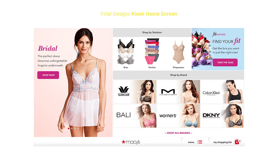
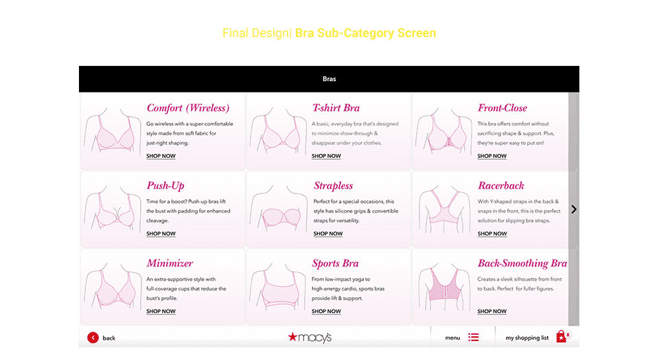
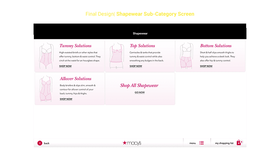
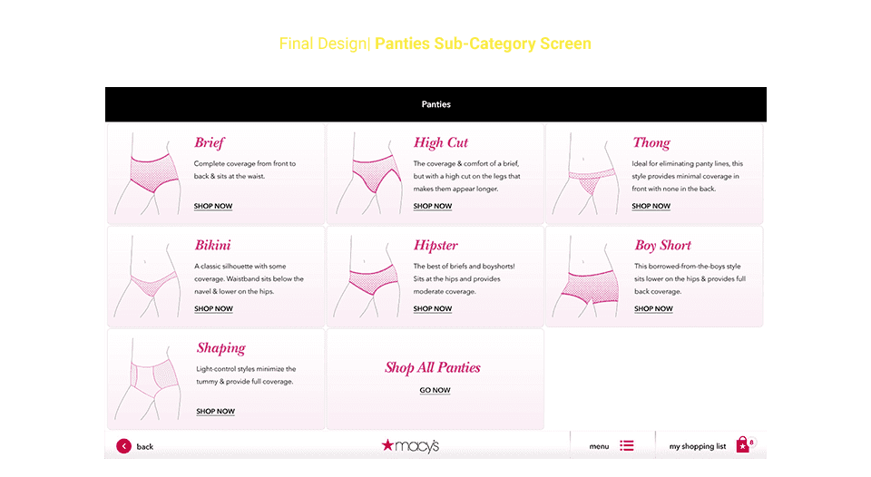
The above are high-fidelity comps of the main landing users would see on the kiosk, as well as the sub-categories, featuring the illustrations. Below are the screens the user would see when taking the quiz.